Elevate
Branding (Ideation)
Havas x Elevate
Junior Design Project
”Our community is open to all kinds of women - we welcome the differences and traits that set us apart. We are professional but we love a bit of fun, lean on us as a pillar of support and embrace the art of connection.”
Brief:
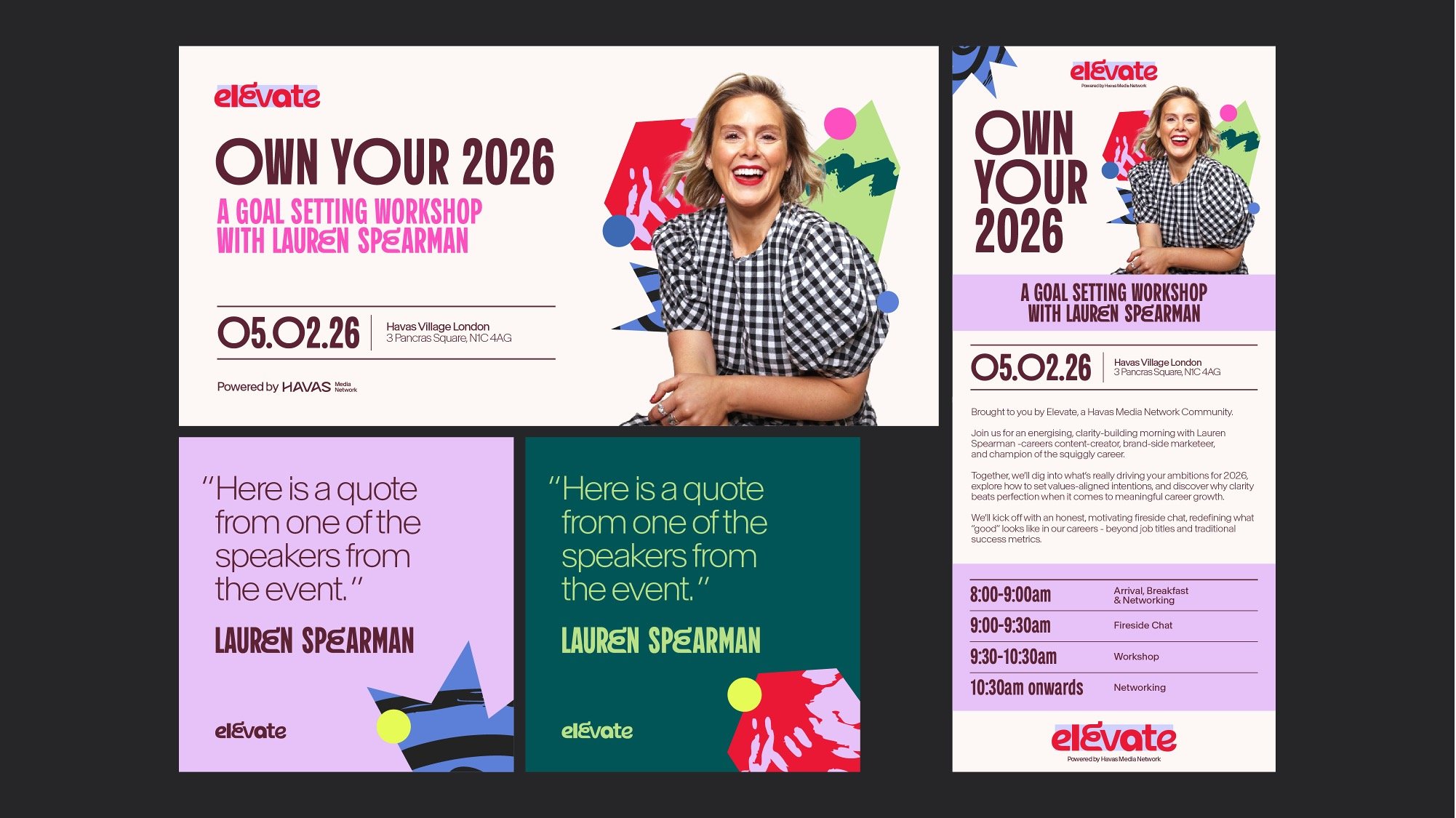
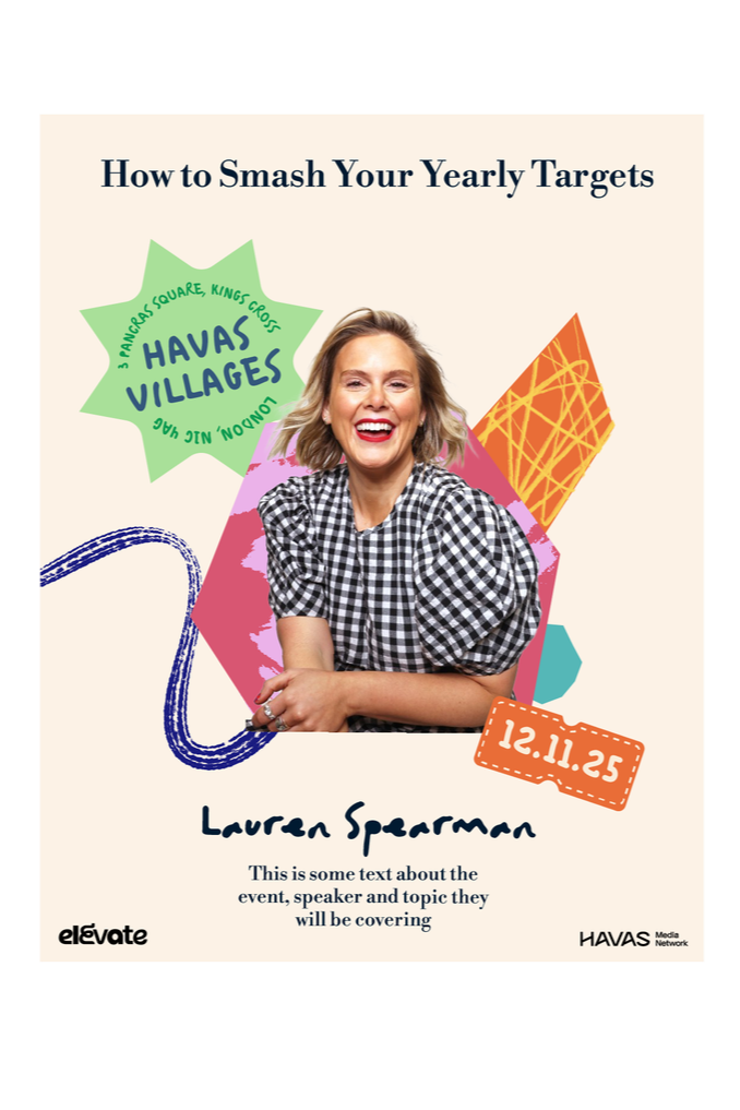
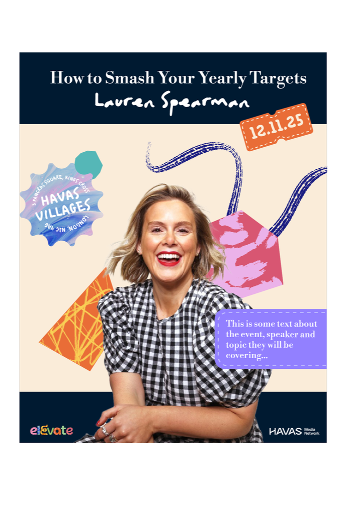
Develop a brand identity for an intimate, female-only networking event, supported by Havas Media Network.
The event is a fun, non-corporate opportunity for mid-senior managers to connect with others, build meaningful relationships, explore professional growth, whilst having fun in the process.
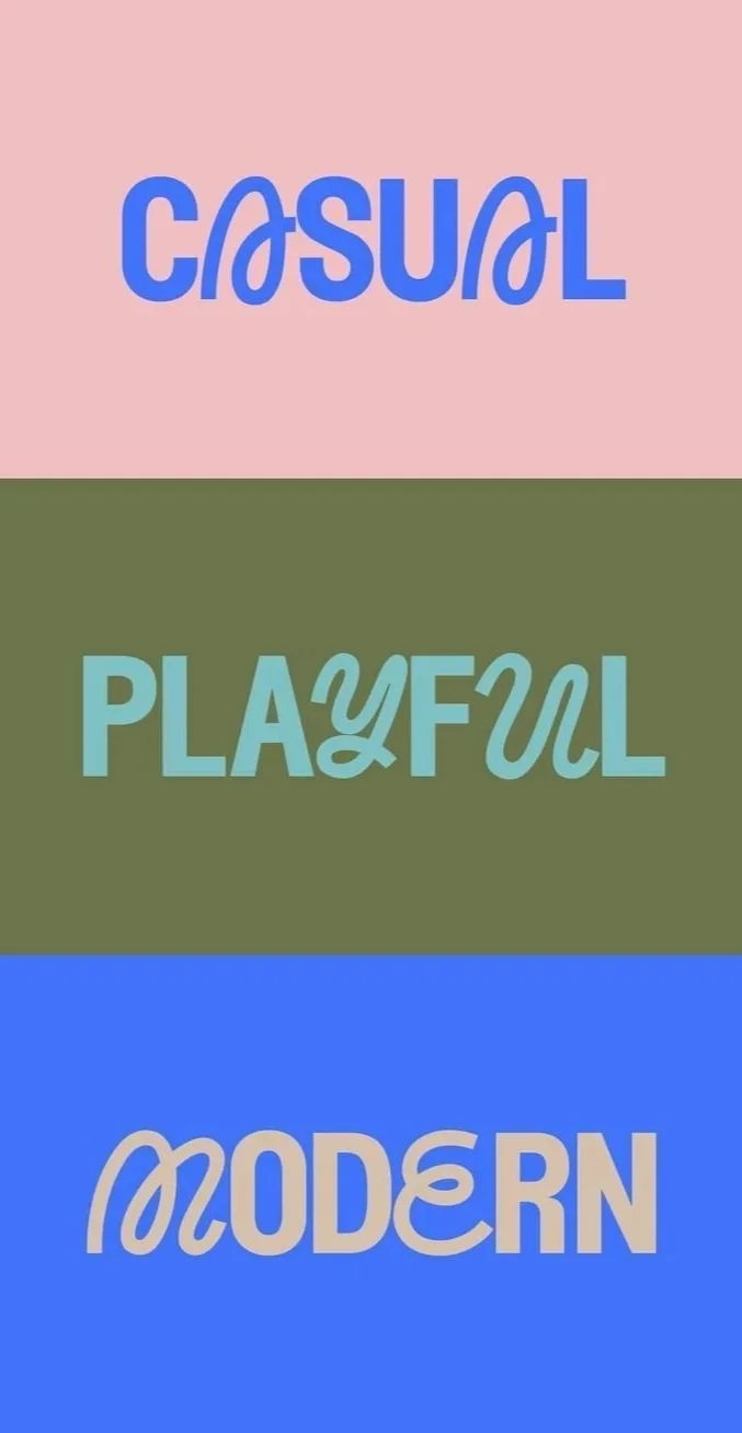
The branding should feel fun, inviting, vibrant, community-led and supportive, yet should retain an air of professionalism. It should steer clear of feeling overly feminine.
Solution:
Typographic Route -
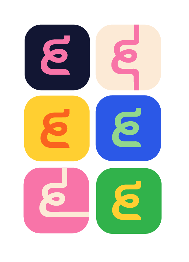
Logo:
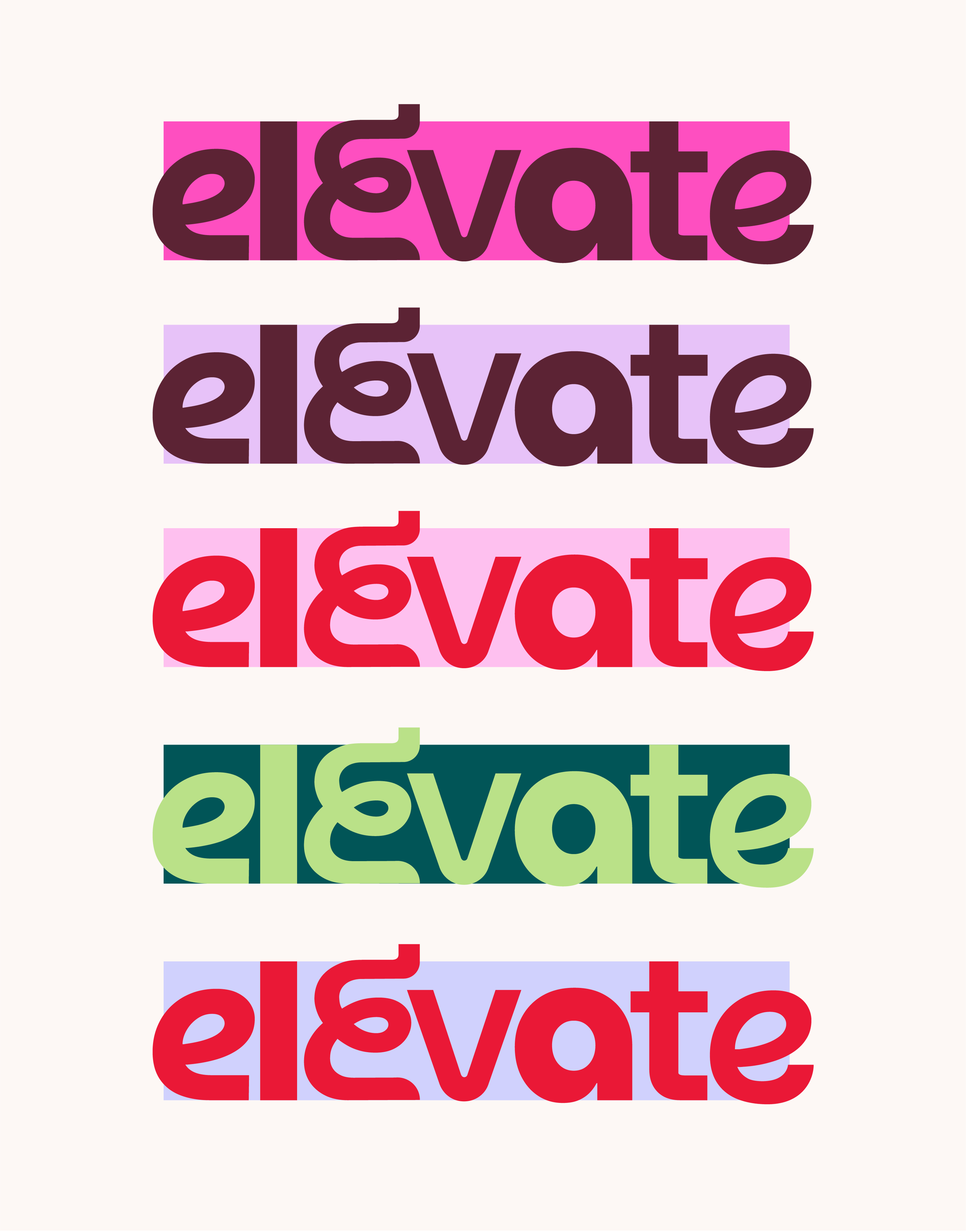
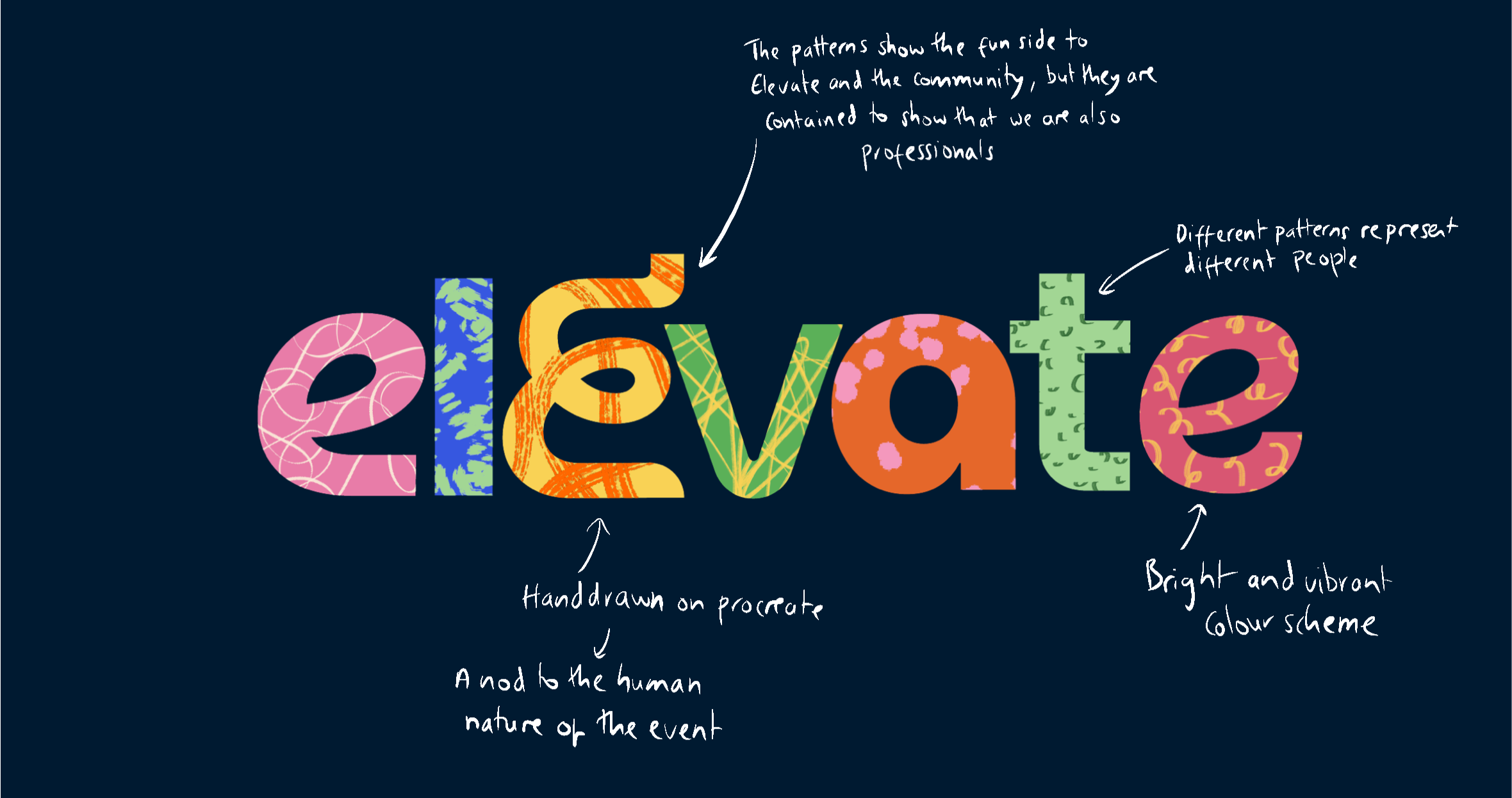
The logo contains a curved glyph of the letter “E” to symbolise connection and the link to community, whilst feeling friendly, fun and inviting.
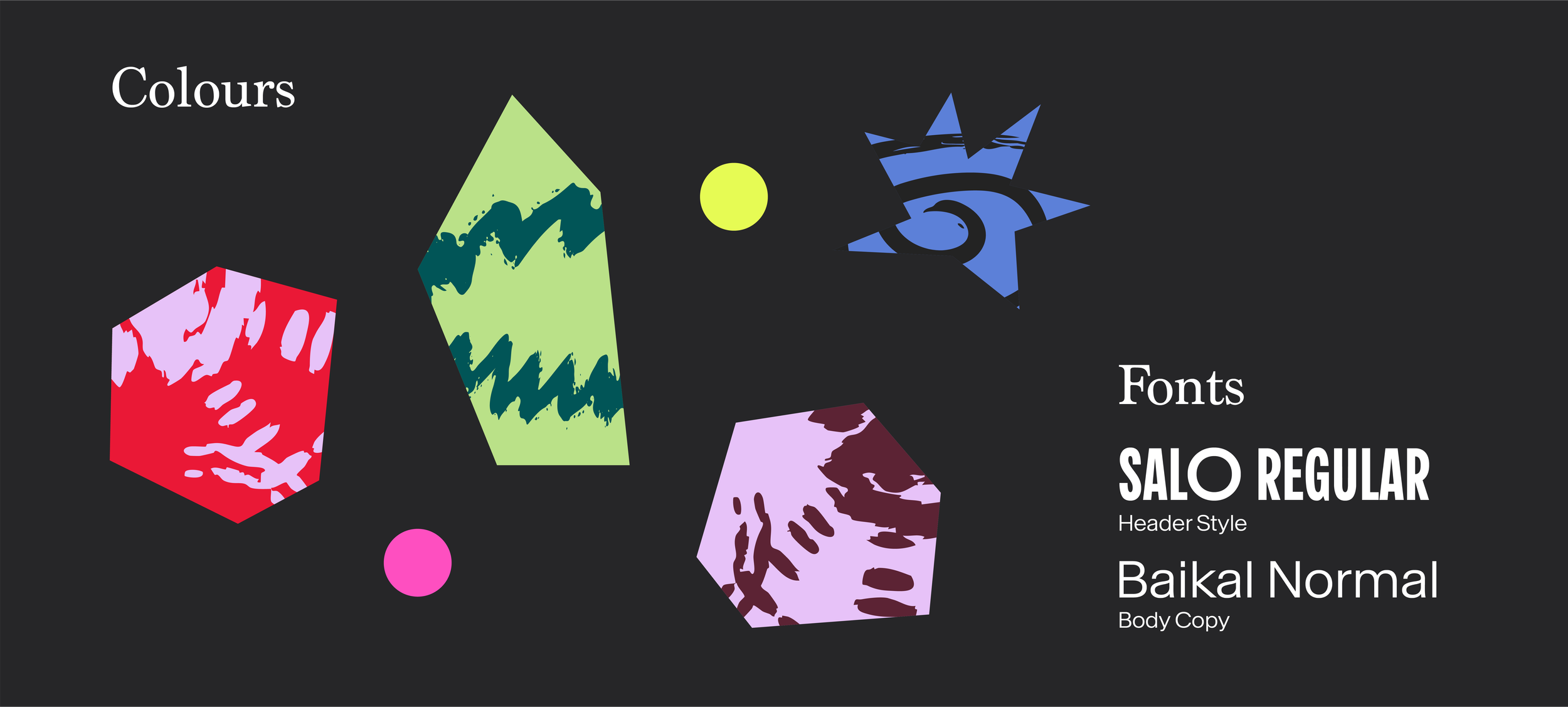
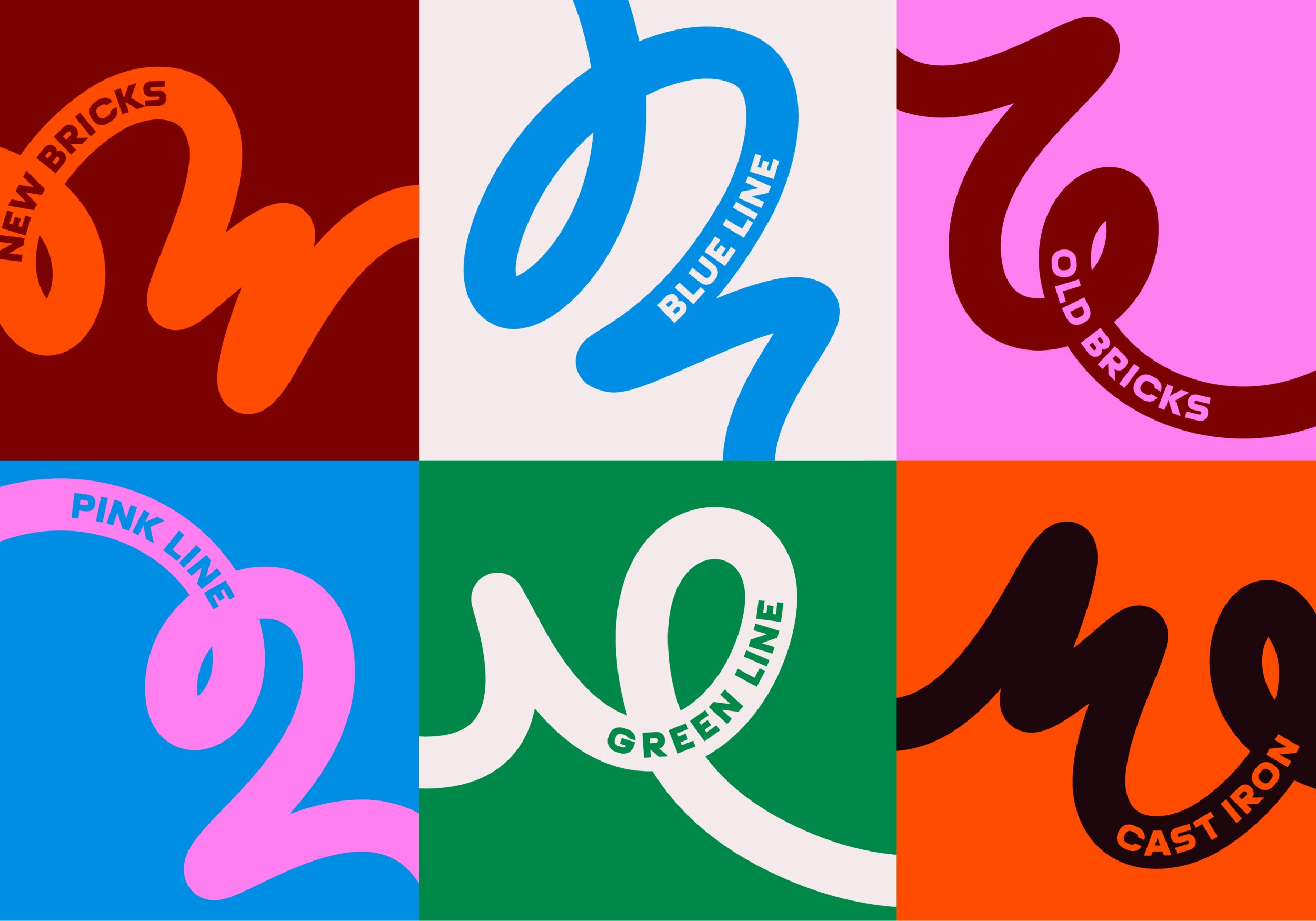
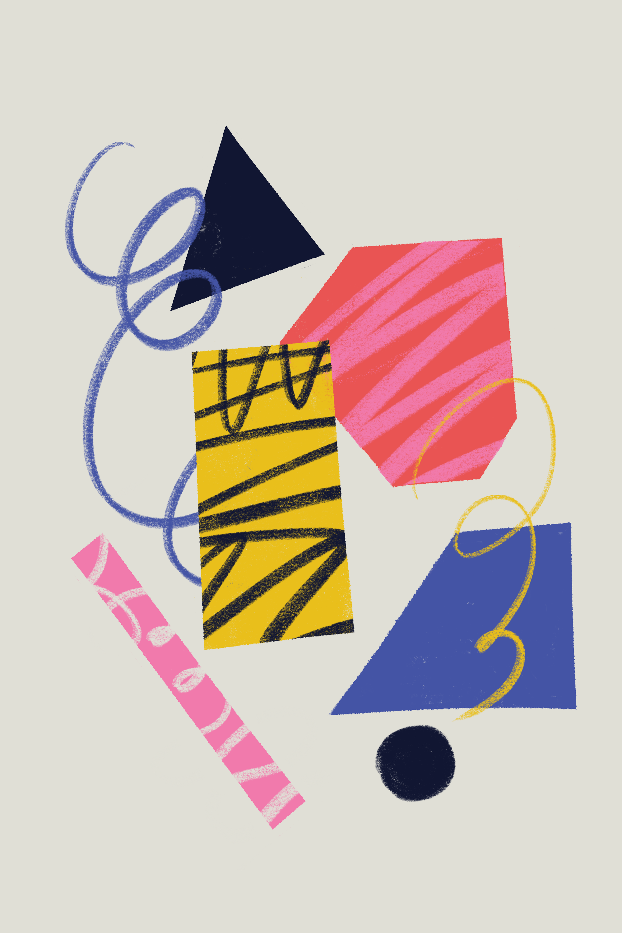
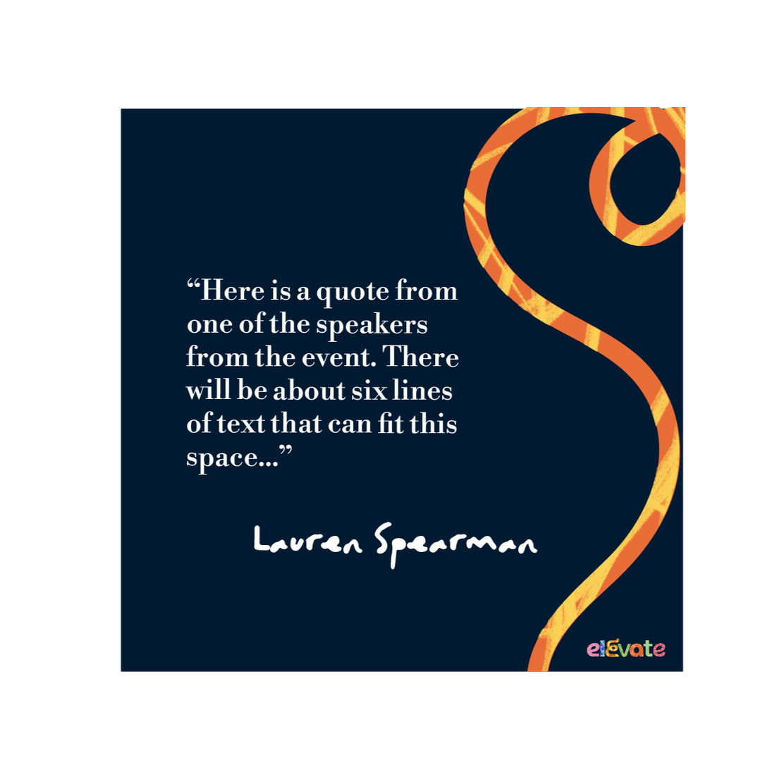
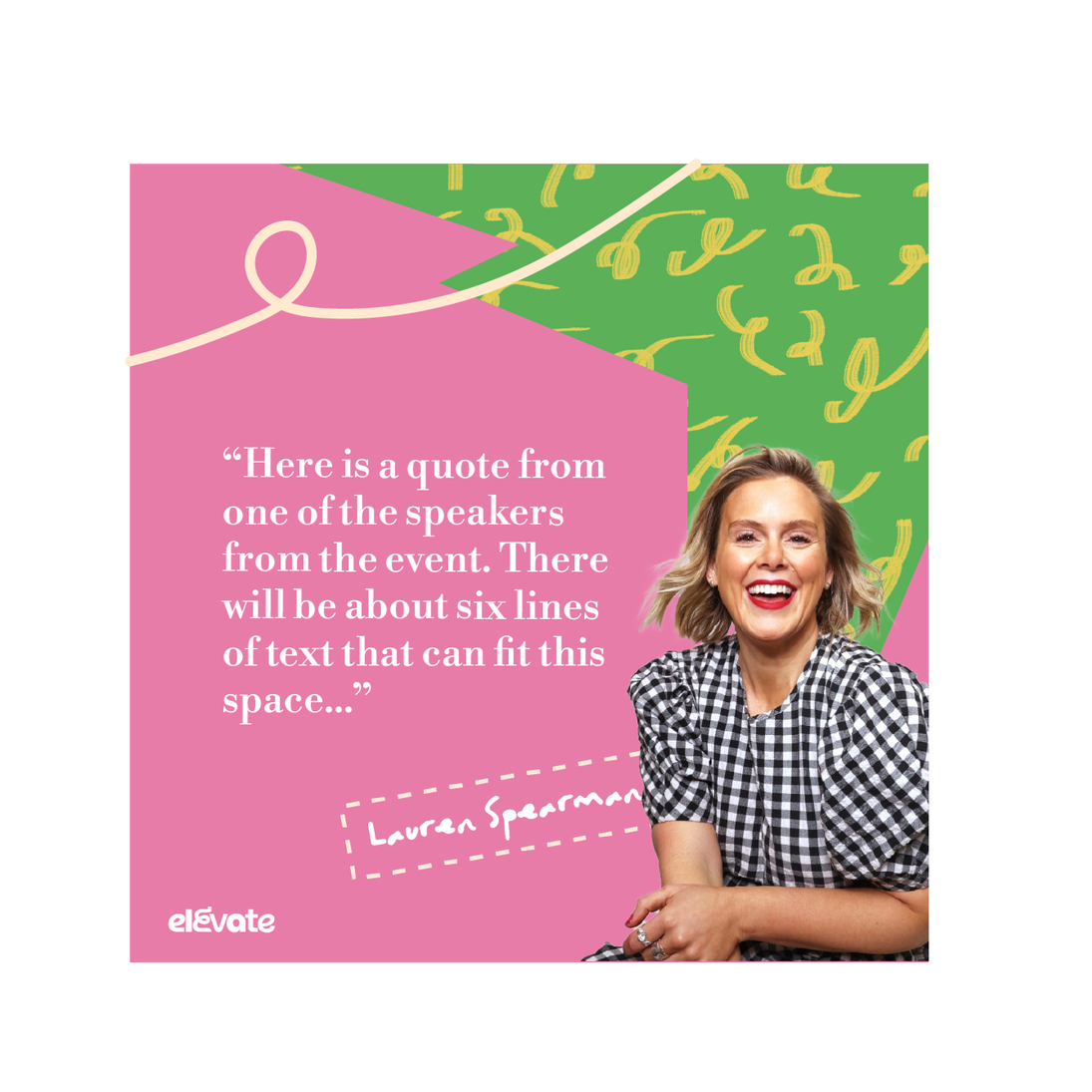
Key Visual Assets:
The differing patterns indicate the messiness and fun of life, but they are contained in shapes to show how Elevate can give some structure to our chaos.
Team:
Sonia Mangalage (Junior Designer):
Ideation and Design Concept, Logo Creation, Initial Asset Exploration
Alice Bishop (Designer):
Body Copy Typography, Final Colour Scheme, Final Rollout
Logo References
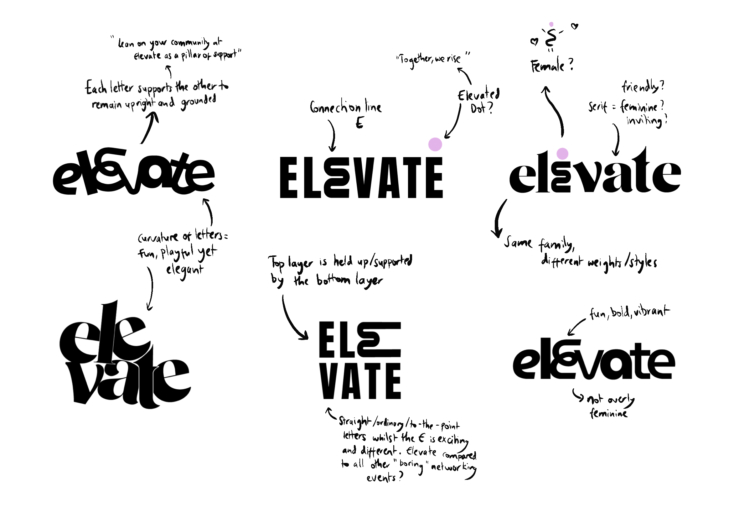
Logo Exploration
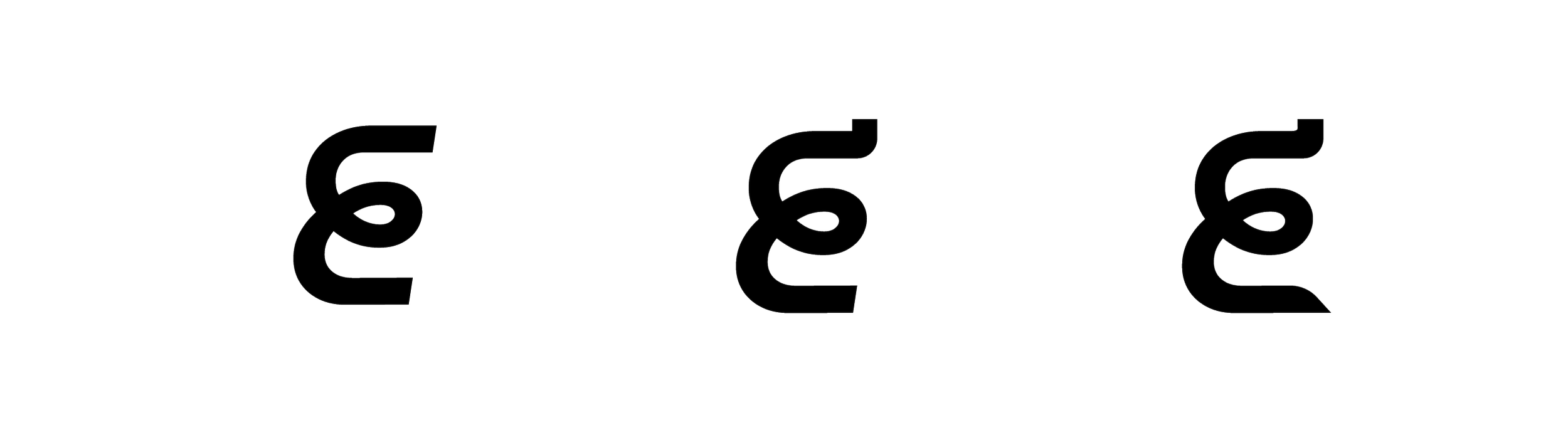
Typeface Adjustments
The initial E felt unstable, with the cut edges giving off the impression of speed.
Creating a curved, upwards-facing end point gives the audience the impression of elevation and rising high.
Lengthening the bottom so that it curves down indicates that the E is grounded from the bottom and travelling upwards.
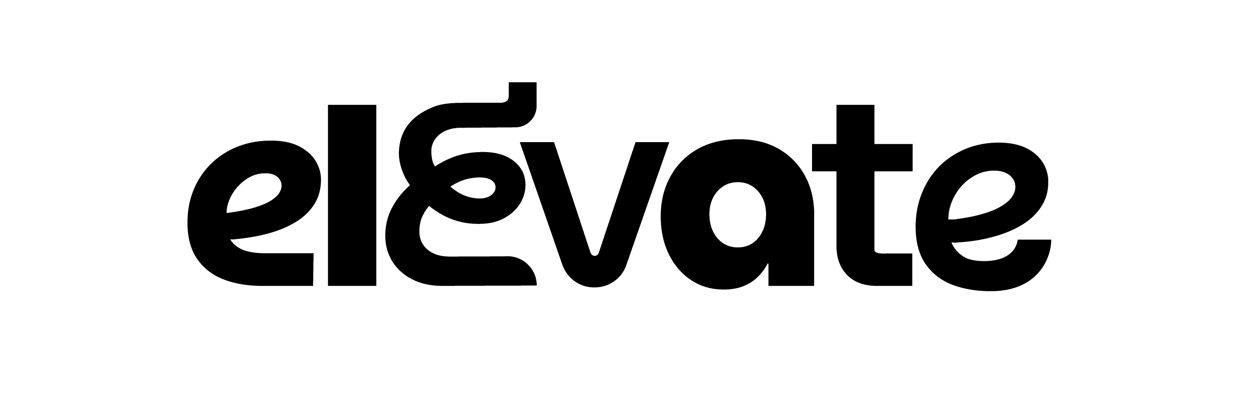
Final Logo Design
Although each letter is different in weight and style, they all belong to the same font family, Museo Moderno, representative of the fact that although we are all unique, with different experiences and thoughts, we all belong to the sisterhood. The curvature of the letters give off an inviting, friendly and slightly feminine feel, indicating the fun and vibrant nature of Elevate.
The sans serif feels professional, however the use of different weights indicates the informal nature of networking between the mid-senior level managers.
The accent E is a glyph. It symbolises connection and a link to community.
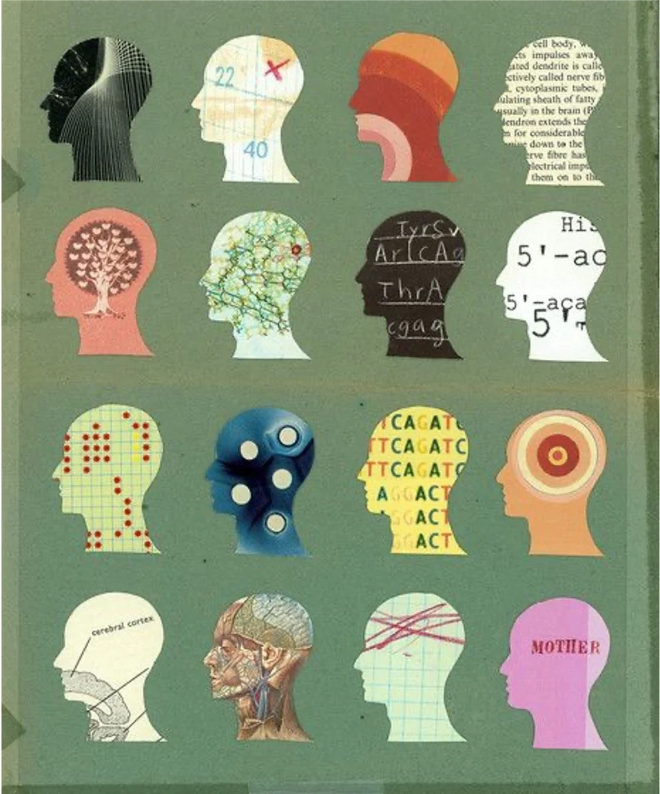
Initial Exploration
References
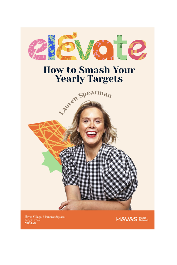
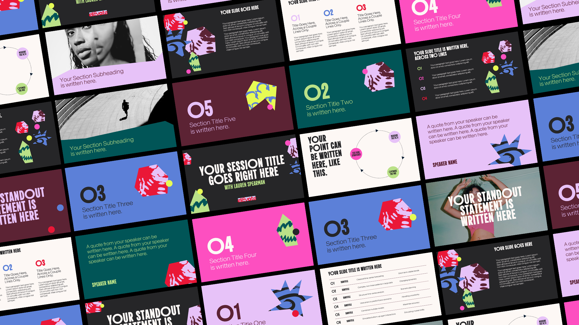
Final Design and Rollout