
Havas Press Releases
Conceptualisation, Image Manipulation
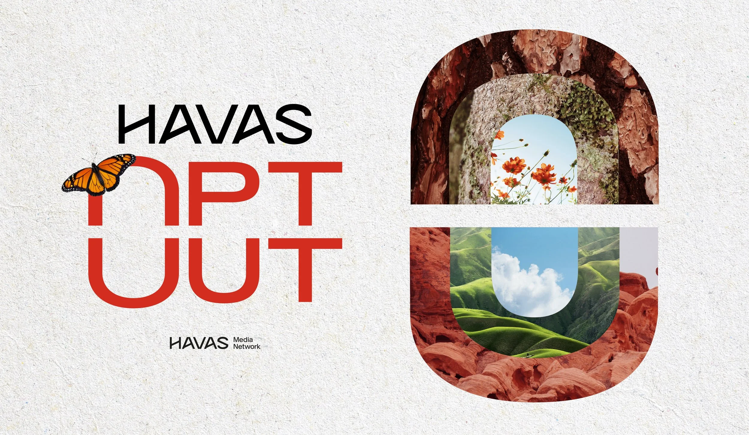
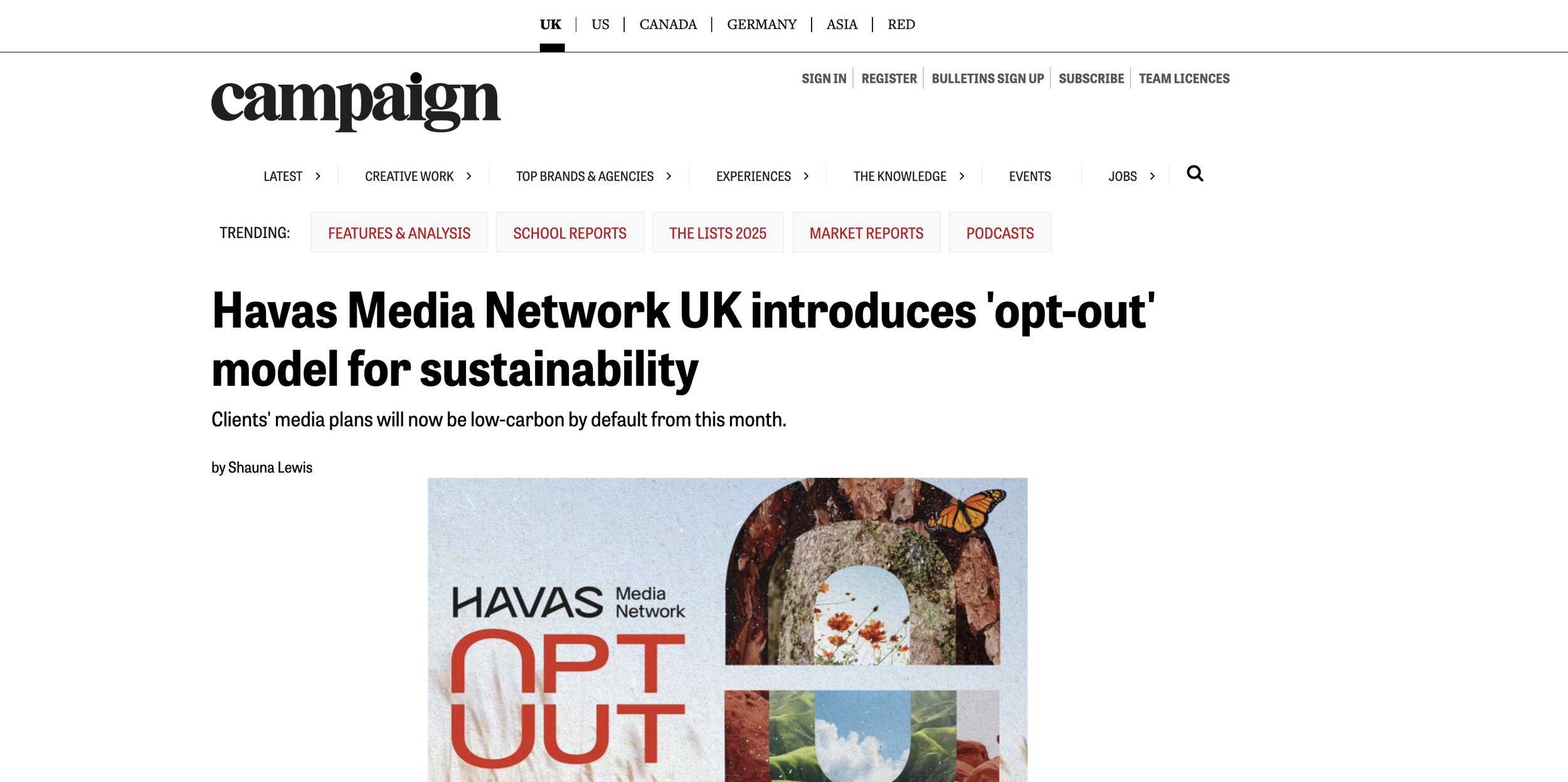
Havas Press Release Opt-Out
Junior Design Project
”What kind of world will you leave behind?”
Brief:
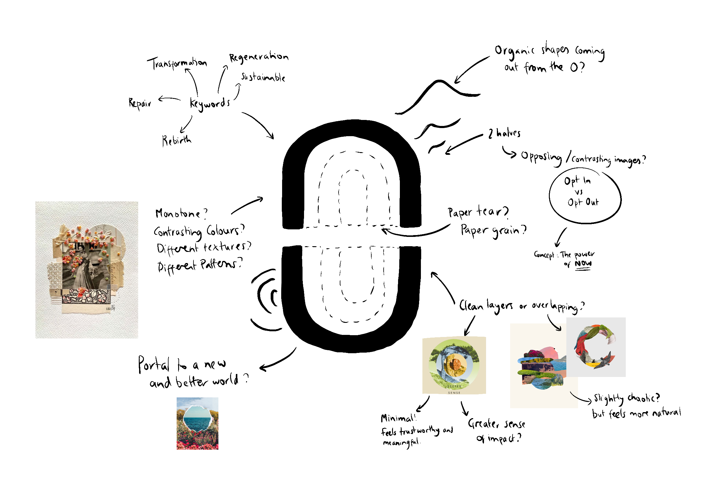
Create an image that represents Opt-Out, a model that results in automatic enrolment into lower carbon media processes and practices for Havas’ Clients and Partners, to accompany the press release.
Our clients should see this as a meaningful and necessary change, so the image must reflect this. It should feel harmonious, sustainable and impactful, whilst keeping in line with the Opt-Out brand guidelines.
Solution:
Minimalistic Collage -
The O shaped symbol from the Opt-Out logo visually tightens the image to the logo and creates a sense of unity. Paper grain texture was used to indicate the use of recyclable materials within sustainable media practices.
Each ring of the O supports the other, giving a sense of the “collective action” that we see from Opt-Out.
Butterfly symbolism indicates the transformation and renewal of our practices, whilst also providing a sense of how delicate our planet is.
The images used are organic shapes found in nature, e.g. wood rings, leaf veins and water/sea.
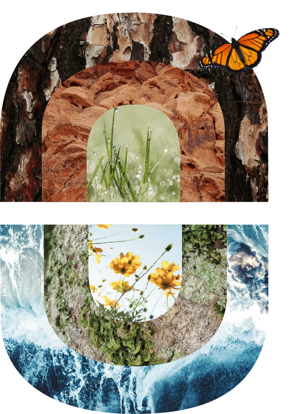
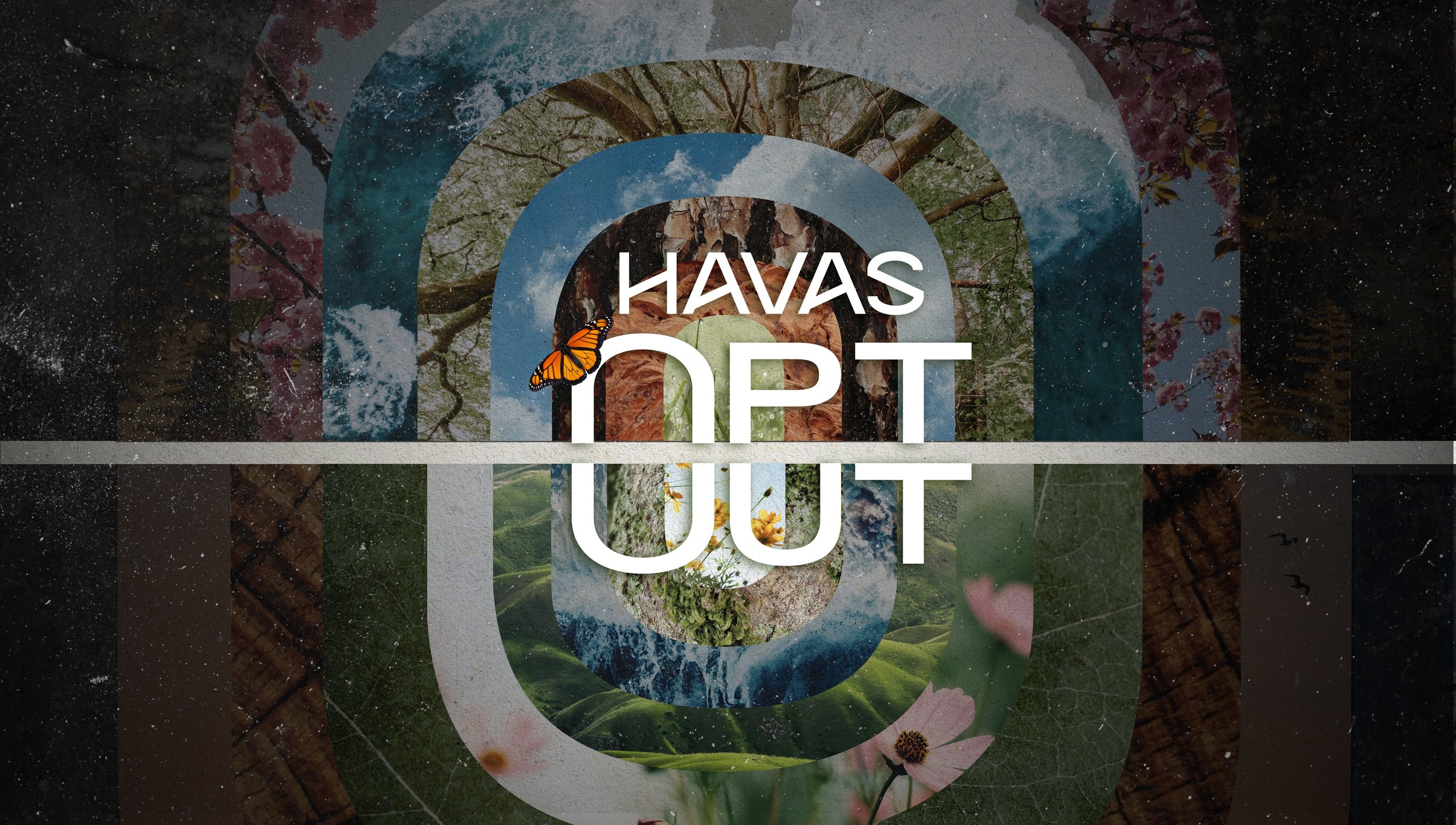
V1
Original Version
Existing Logo
Ideation
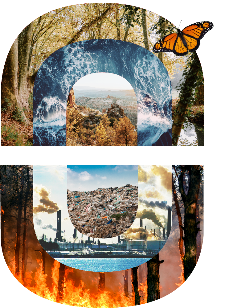
Concept 1 - Bring Back Beauty
Showing the environment the way that it should be, encouraging the viewer to stay opted-in to the scheme. The imagery instils a sense of pride and love for our planet.
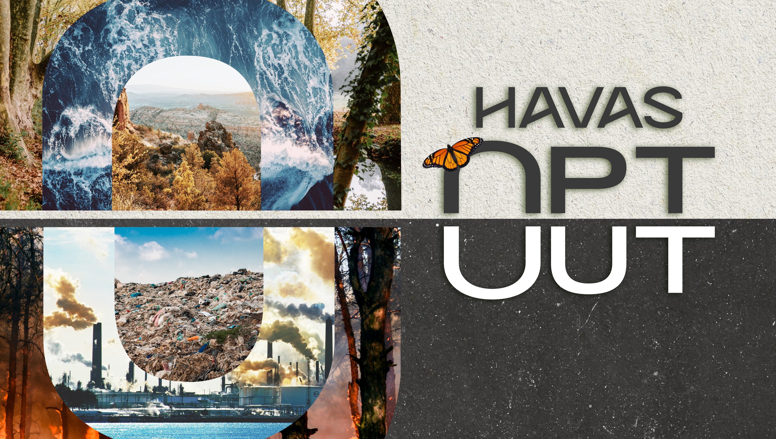
V2
After Feedback to Adjust the Colouring to
Suit Havas’ Primary Colour, Red
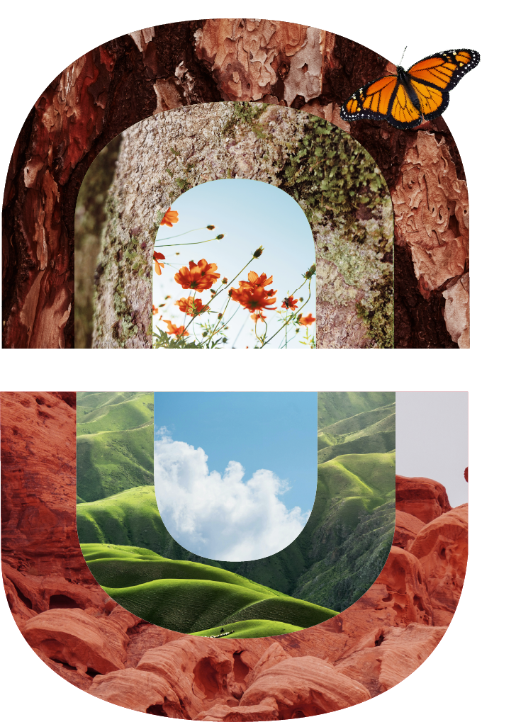
Initial Drafts - Concept 1 - Bring Back Beauty
Concept 2 - The Power of Now
Staying “Opted In” indicates supporting the top half of the O Image, choosing to “Opt-Out” indicates supporting the bottom half. The two contrasting and opposing sides show us the Power of Now.
Initial Drafts - Concept 2 - The Power of Now
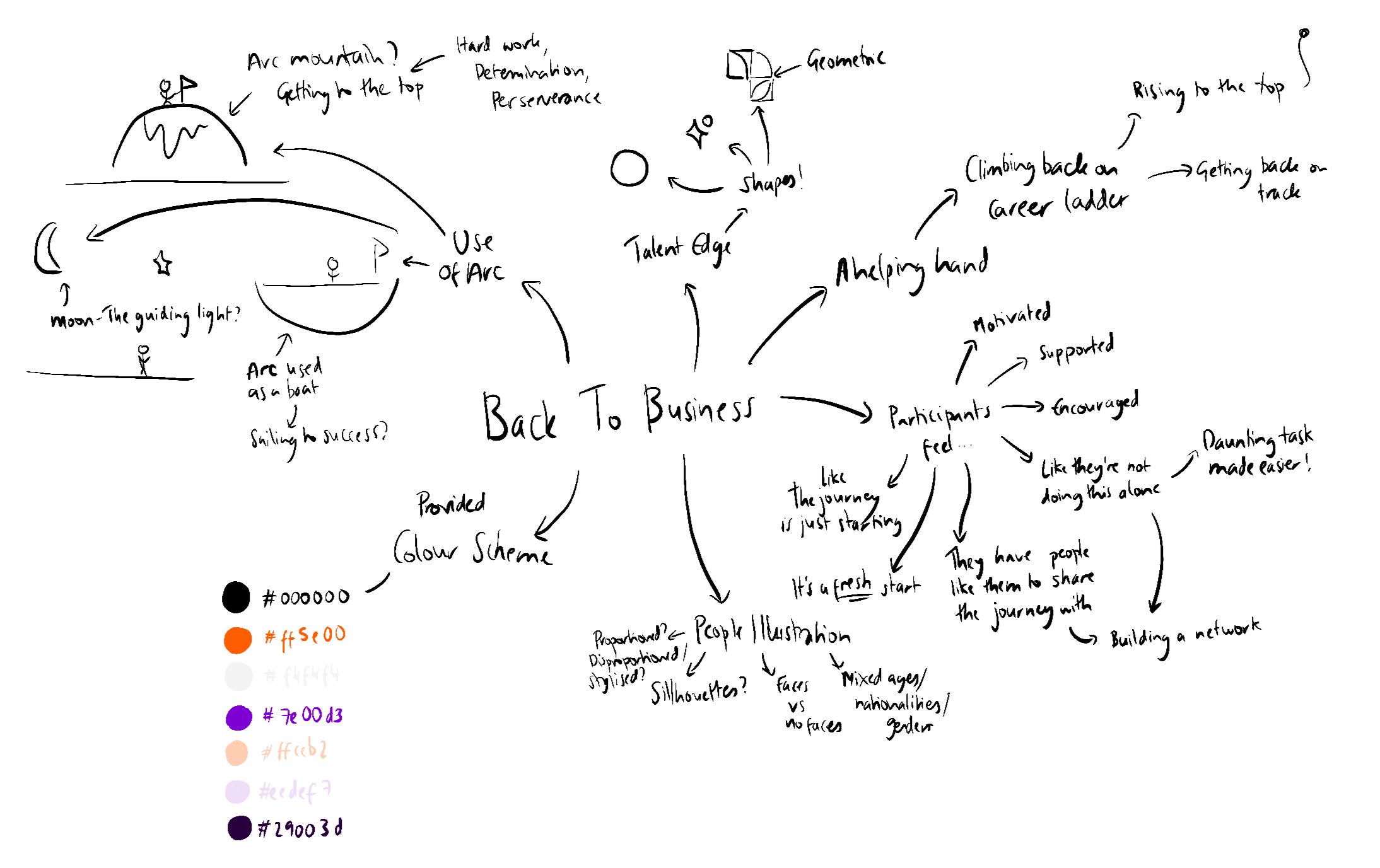
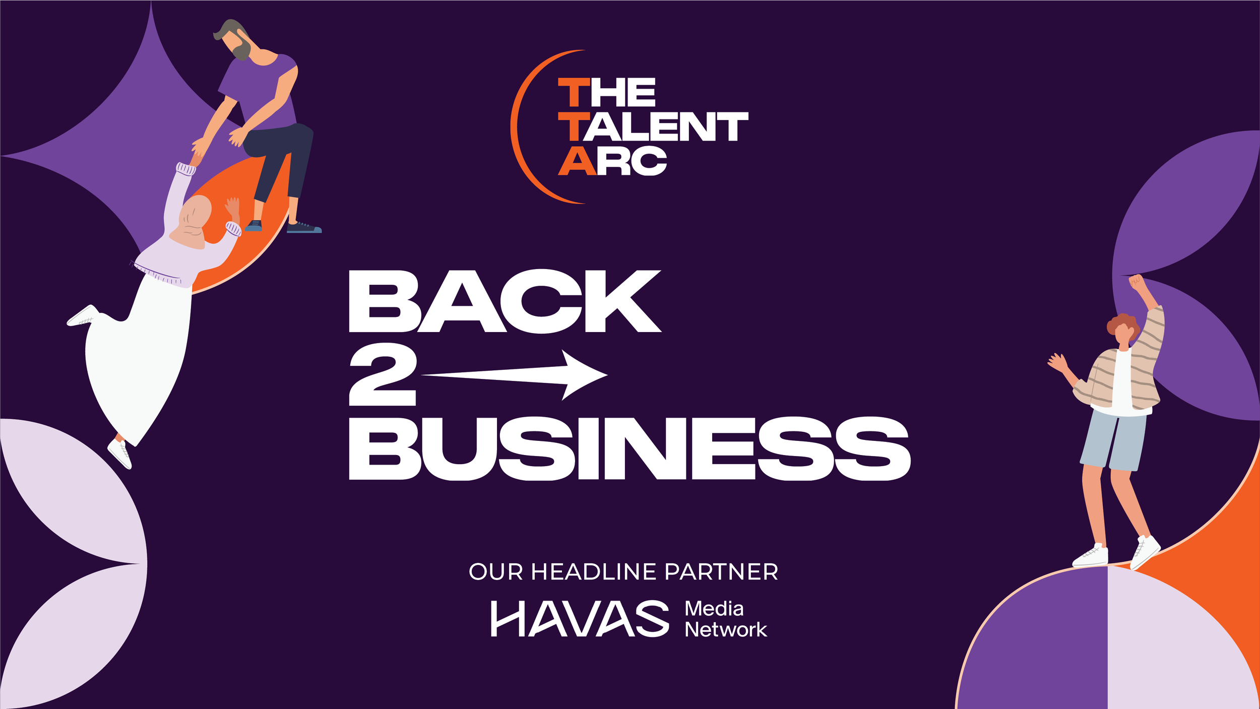
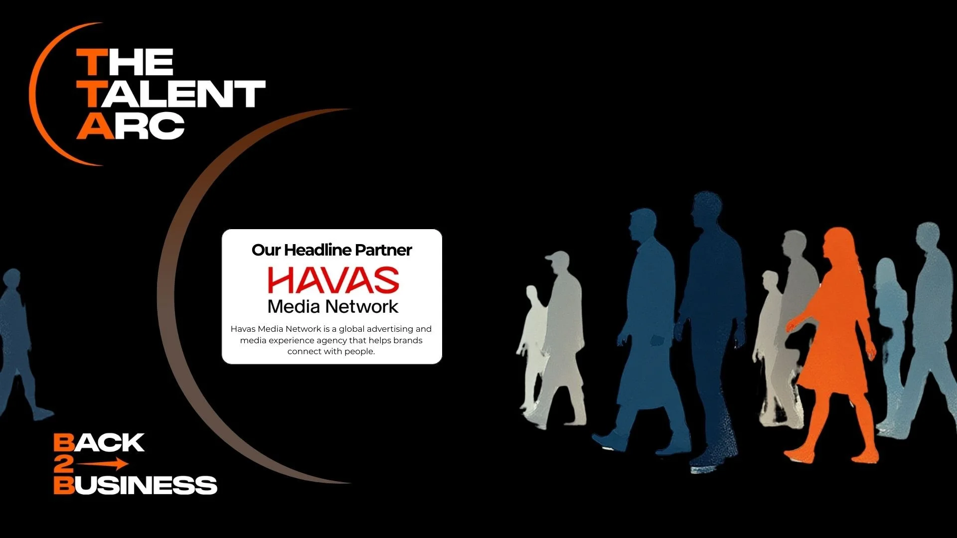
Havas Press Release Back2Business
Junior Design Project
”Make a bridge, not a barrier”
Brief:
Redesign the image provided by the organisation Back2Business (run by TalentArc), to accompany their press release regarding the collaboration of Havas with their Carer Accelerator Programme, using the brand guidelines provided.
The programme is a free six-day reorientation bootcamp, designed to help experienced professionals who have taken a carer career break, re-enter the industry and get back on the career ladder.
The image should utilise elements from the original, but should also feel supportive, encouraging and friendly.
Make sure to include all of the logos and text from the original.
Solution:
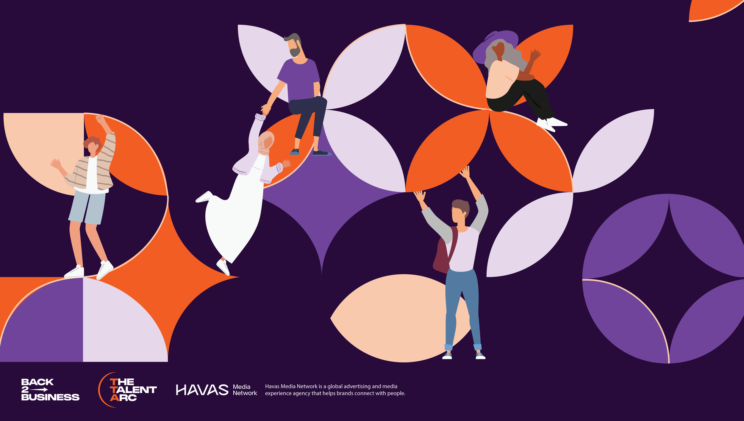
Key Visual Assets from the Partner branding and the provided colour scheme were used to create a refreshed and dynamic composition.
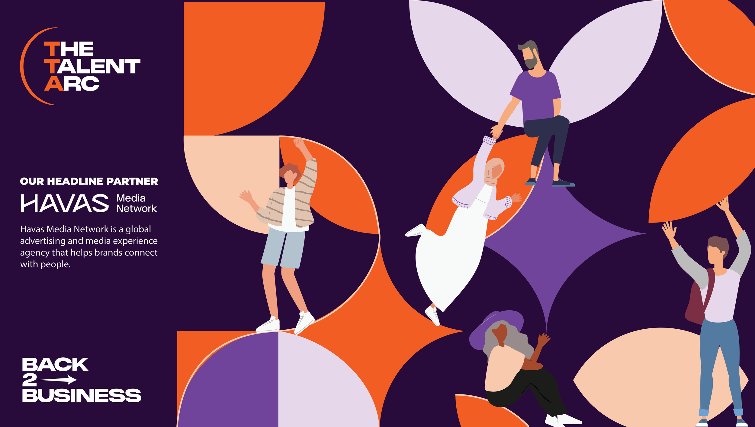
Original Image by Back2Business
The original image felt flat and uninspiring. I wanted to use the arc and illustrated people in a more dynamic way, whilst keeping in line with TalentArc’s branding.
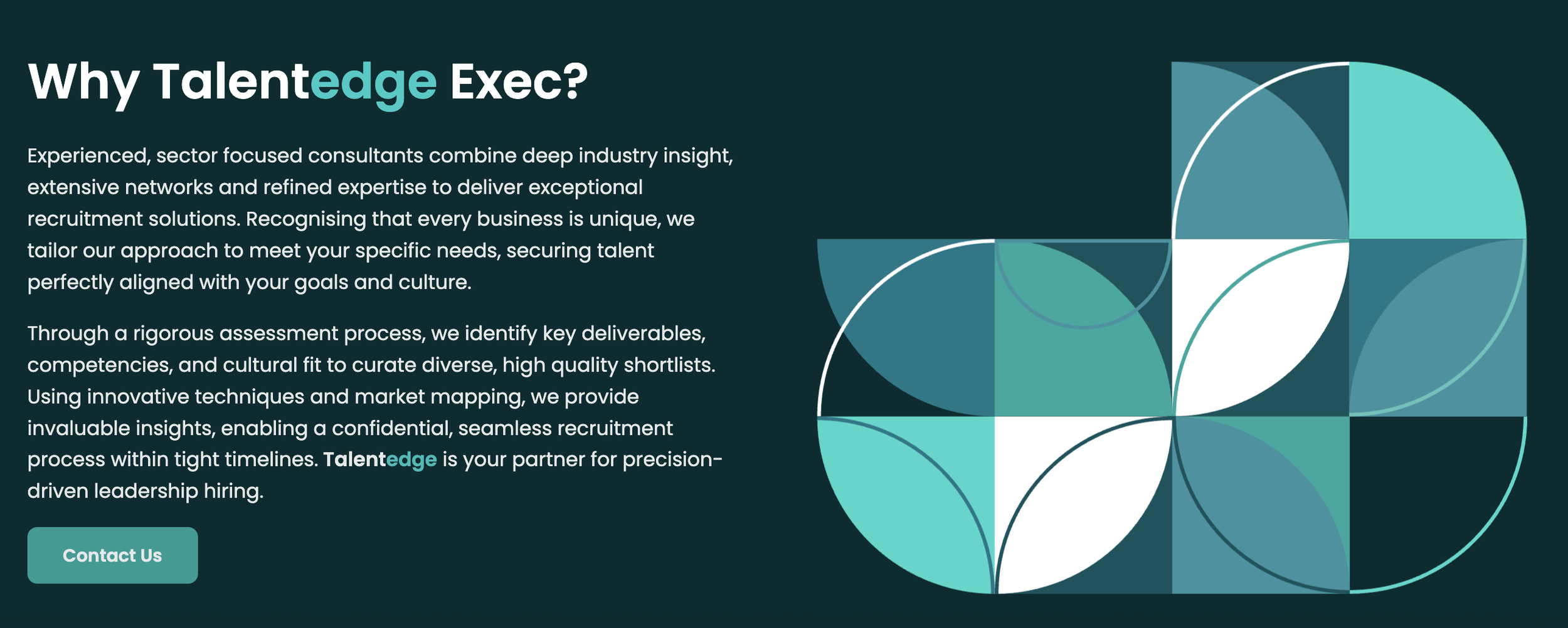
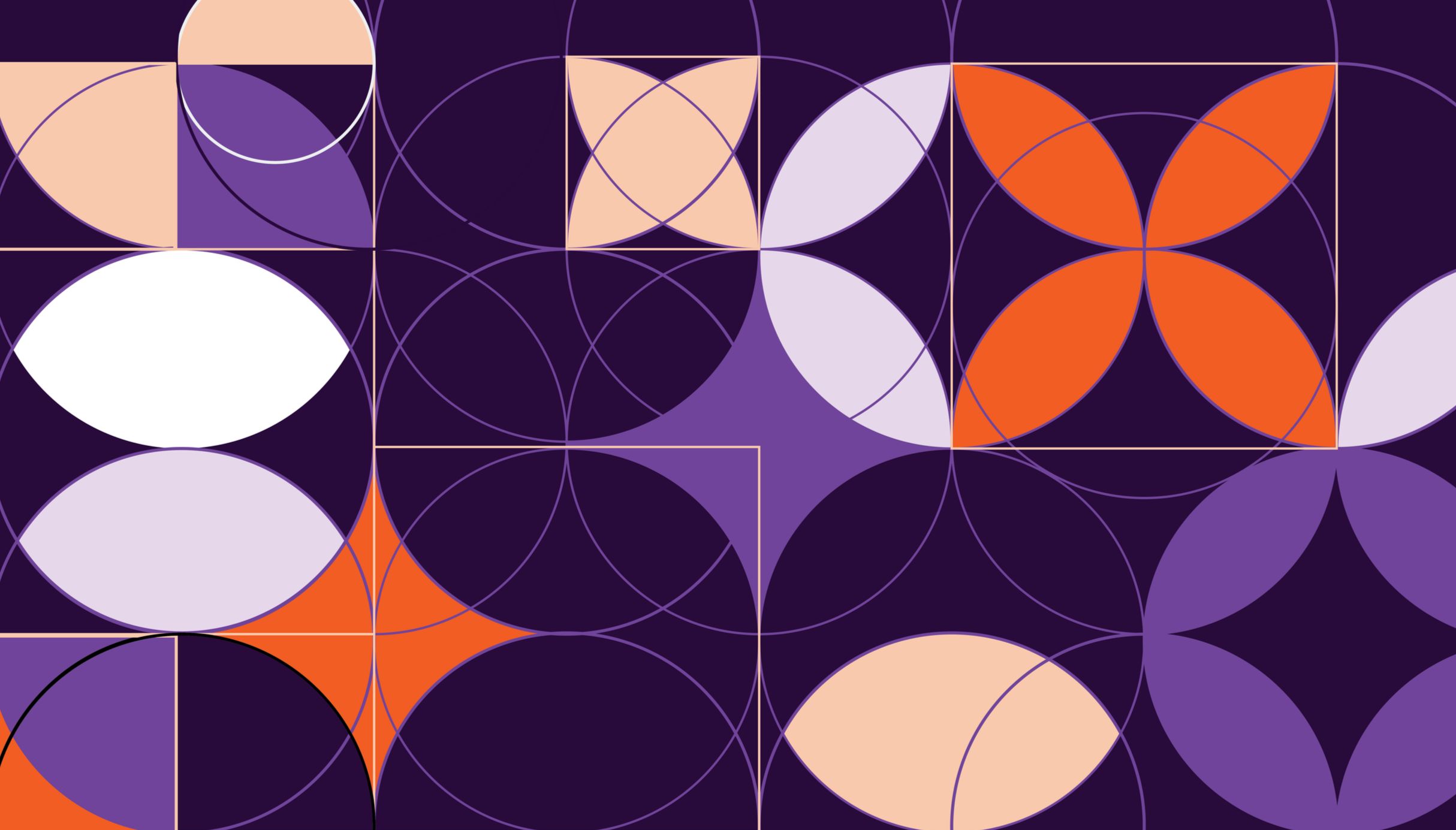
TalentArc’s Design System
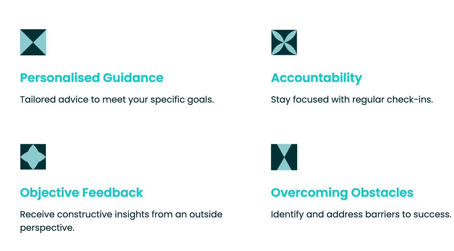
The design system used by TalentArc/TalentEdge was an interesting starting point for the design.

Simple illustrated characters supporting the structure of the shapes, helping each-other and showing enthusiasm were carefully selected to showcase the scheme and its advantages.
Final Design

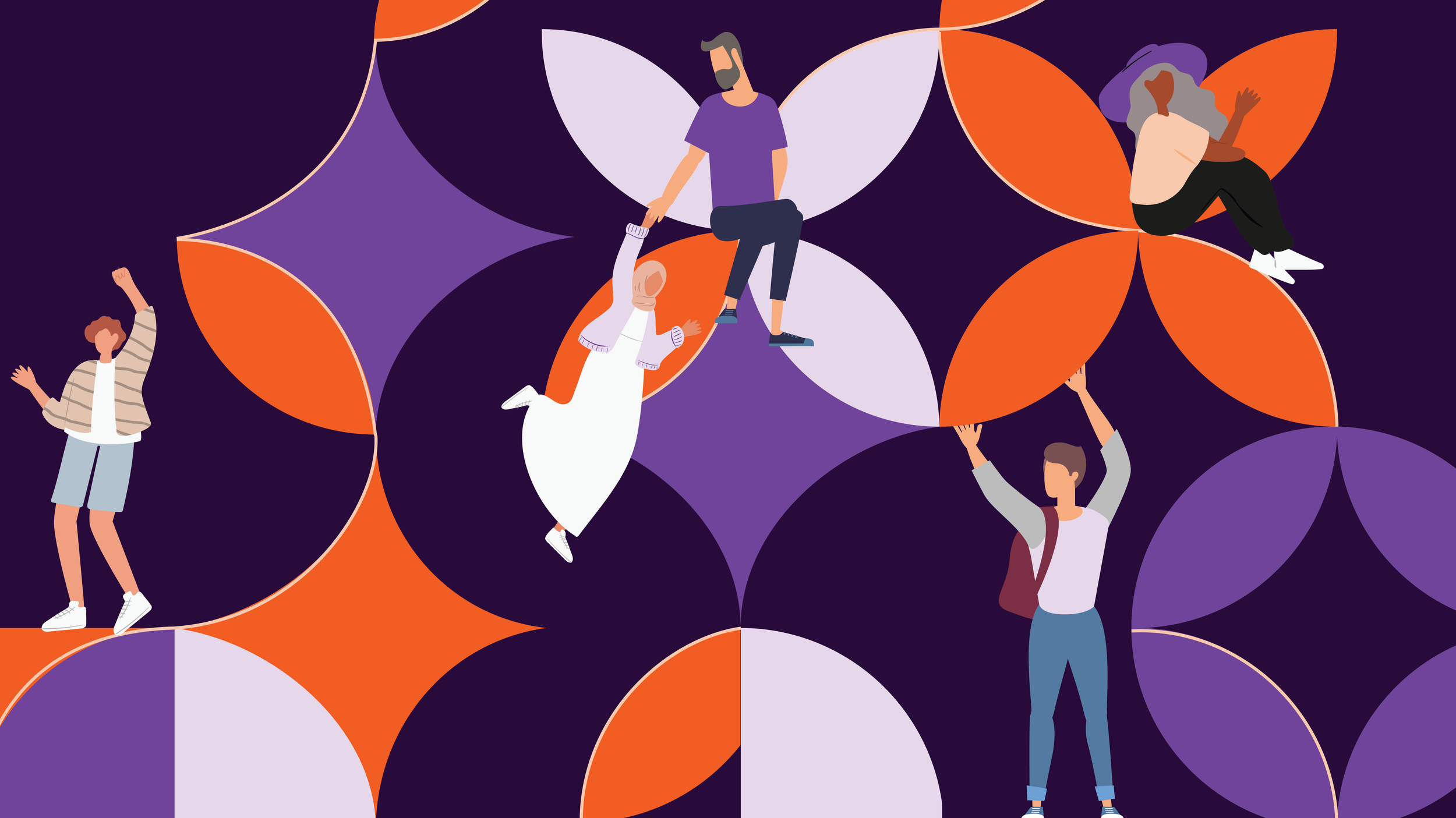
TalentArc’s Design System
The design was then adjusted to reduce clutter and allow for clear logo placement.
Other Text Placement Designs
Before
Comparison
After
Ideation
Back2Business
Conceptualisation, Creation