Opt-Out Press Release (Pt 1)
Conceptualisation, Image Manipulation
Havas Press Release Opt-Out
Junior Design Project
”What kind of world will you leave behind?”
Brief:
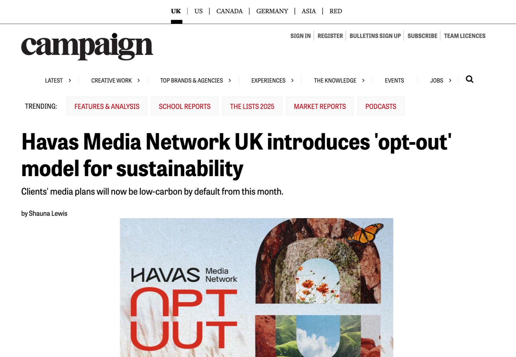
Create an image that represents Opt-Out, a model that results in automatic enrolment into lower carbon media processes and practices for Havas’ Clients and Partners, to accompany the press release.
Our clients should see this as a meaningful and necessary change, so the image must reflect this. It should feel harmonious, sustainable and impactful, whilst keeping in line with the Opt-Out brand guidelines.
Solution:
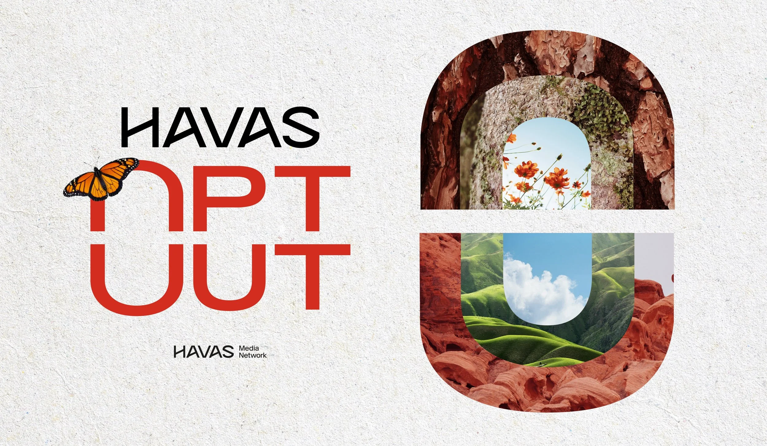
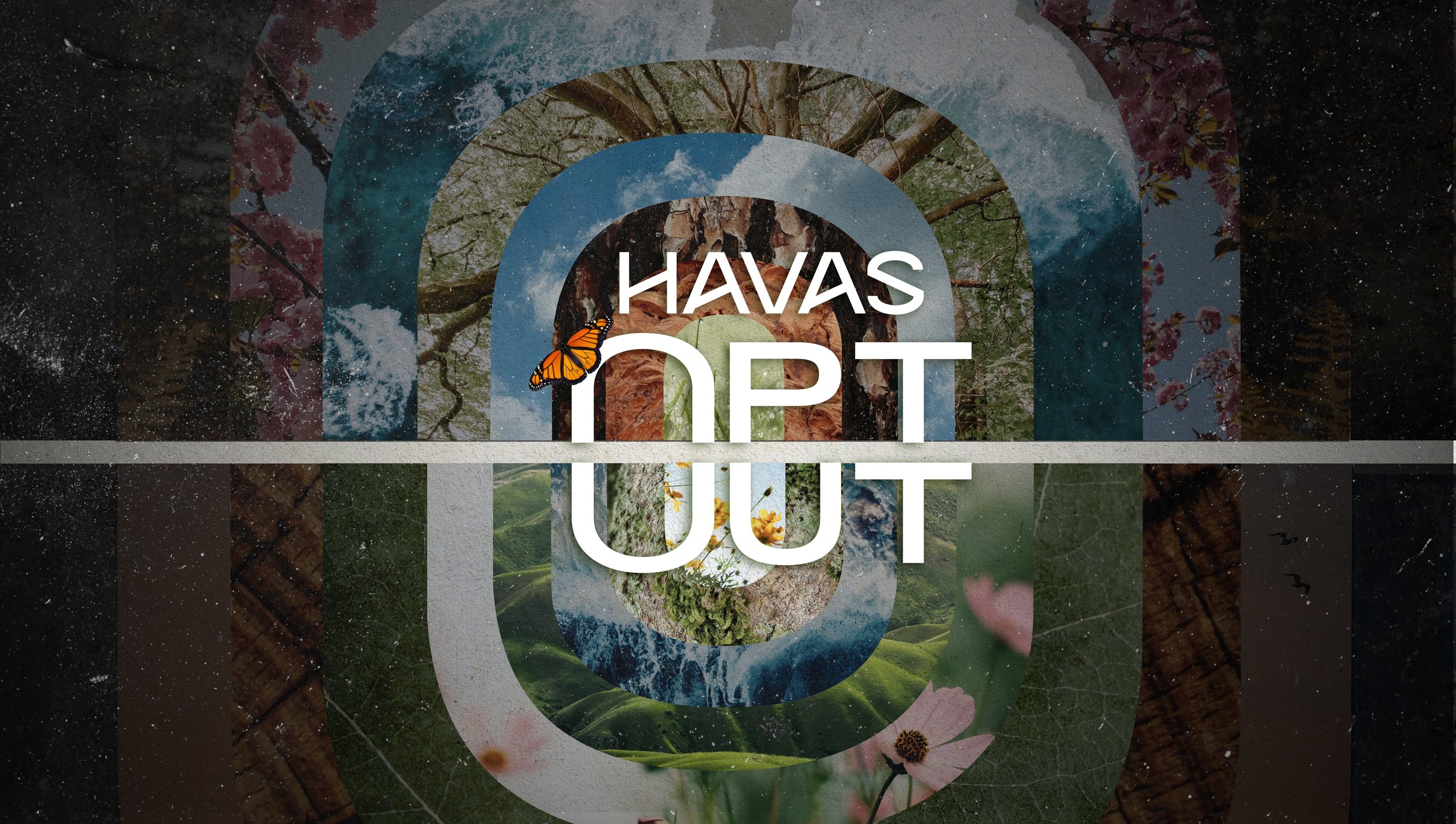
Minimalistic Collage -
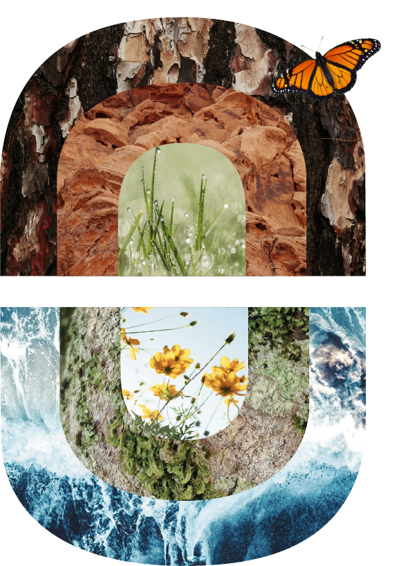
The O shaped symbol from the Opt-Out logo visually tightens the image to the logo and creates a sense of unity. Paper grain texture was used to indicate the use of recyclable materials within sustainable media practices.
Each ring of the O supports the other, giving a sense of the “collective action” that we see from Opt-Out.
Butterfly symbolism indicates the transformation and renewal of our practices, whilst also providing a sense of how delicate our planet is.
The images used are organic shapes found in nature, e.g. wood rings, leaf veins and water/sea.
V1
Original Version
Existing Logo
Ideation
Concept 1 - Bring Back Beauty
Showing the environment the way that it should be, encouraging the viewer to stay opted-in to the scheme. The imagery instils a sense of pride and love for our planet.
V2
After Feedback to Adjust the Colouring to
Suit Havas’ Primary Colour, Red

Initial Drafts - Concept 1 - Bring Back Beauty
Concept 2 - The Power of Now
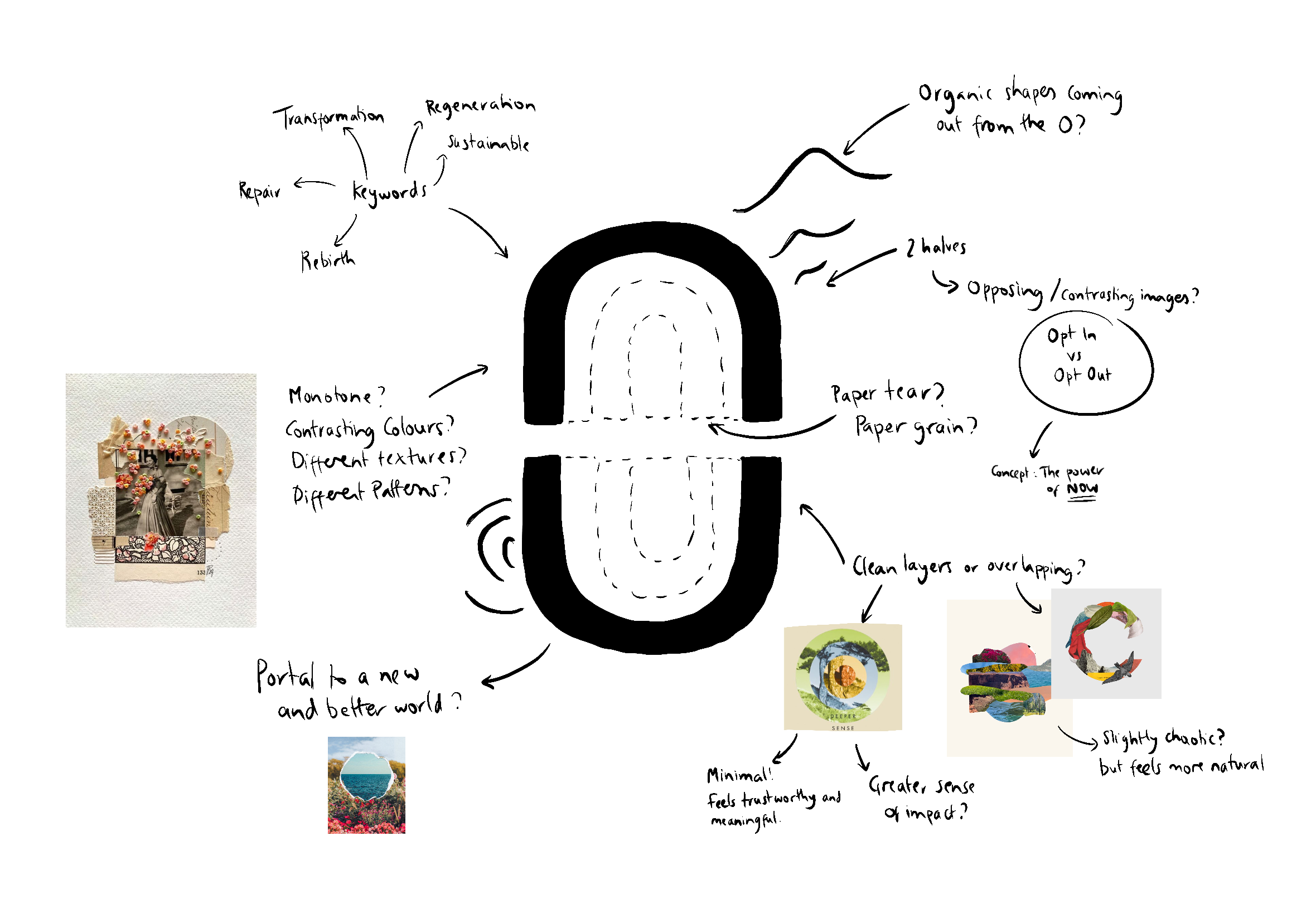
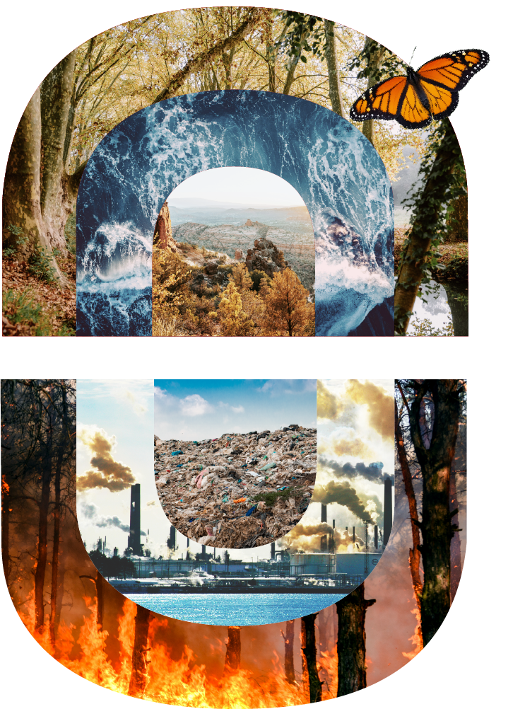
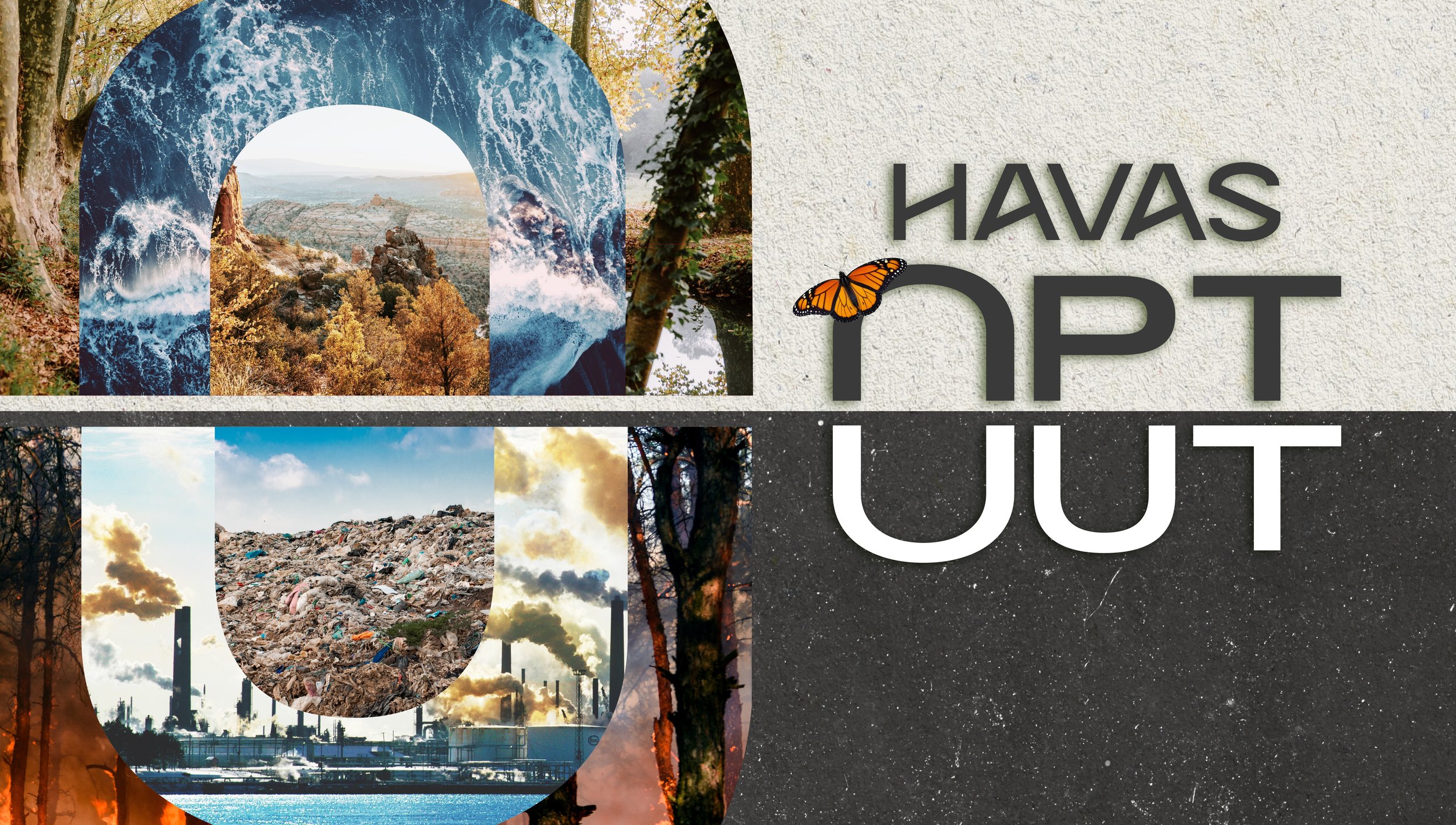
Staying “Opted In” indicates supporting the top half of the O Image, choosing to “Opt-Out” indicates supporting the bottom half. The two contrasting and opposing sides show us the Power of Now.
Initial Draft - Concept 2 - The Power of Now
Final Design
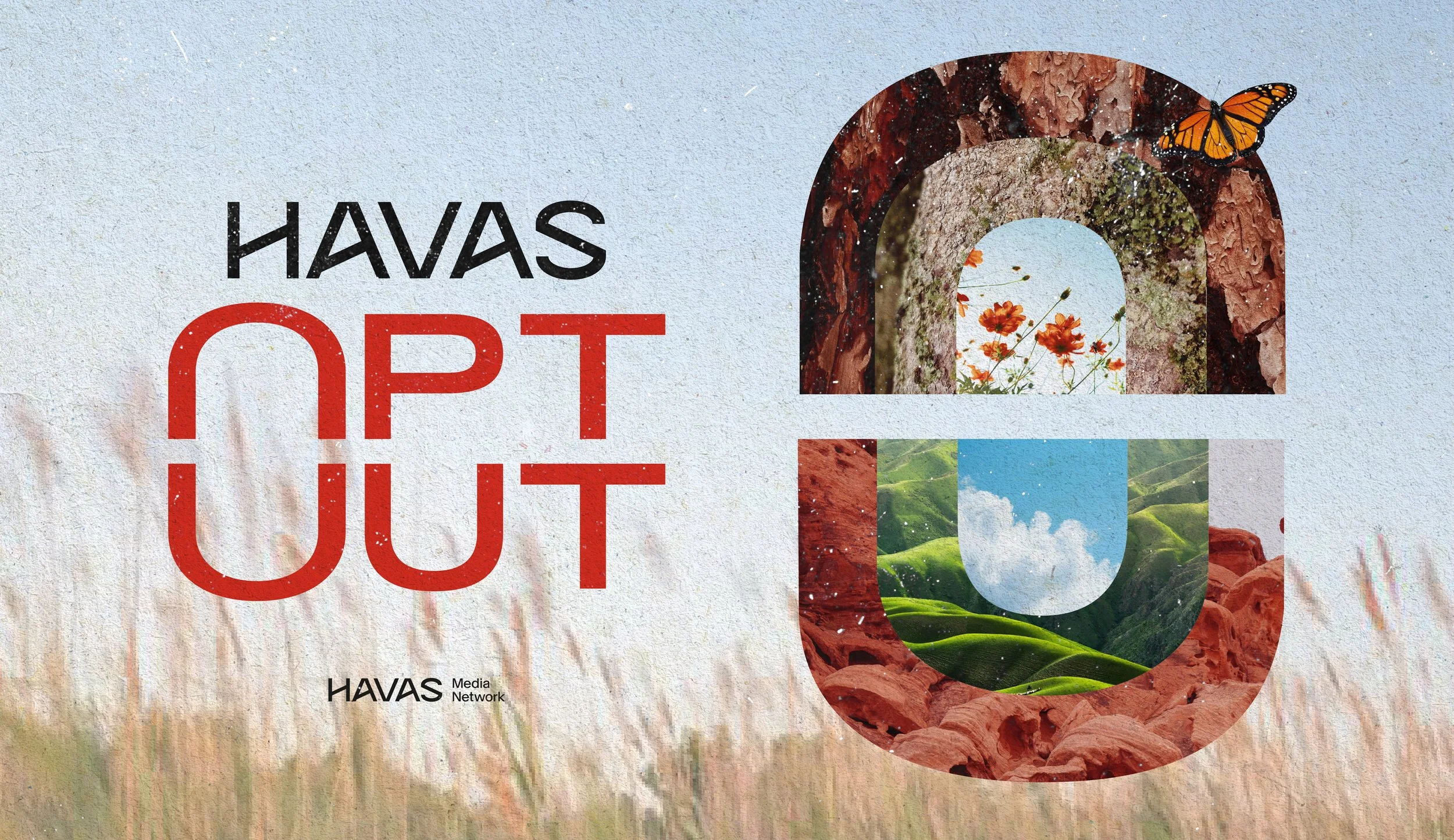
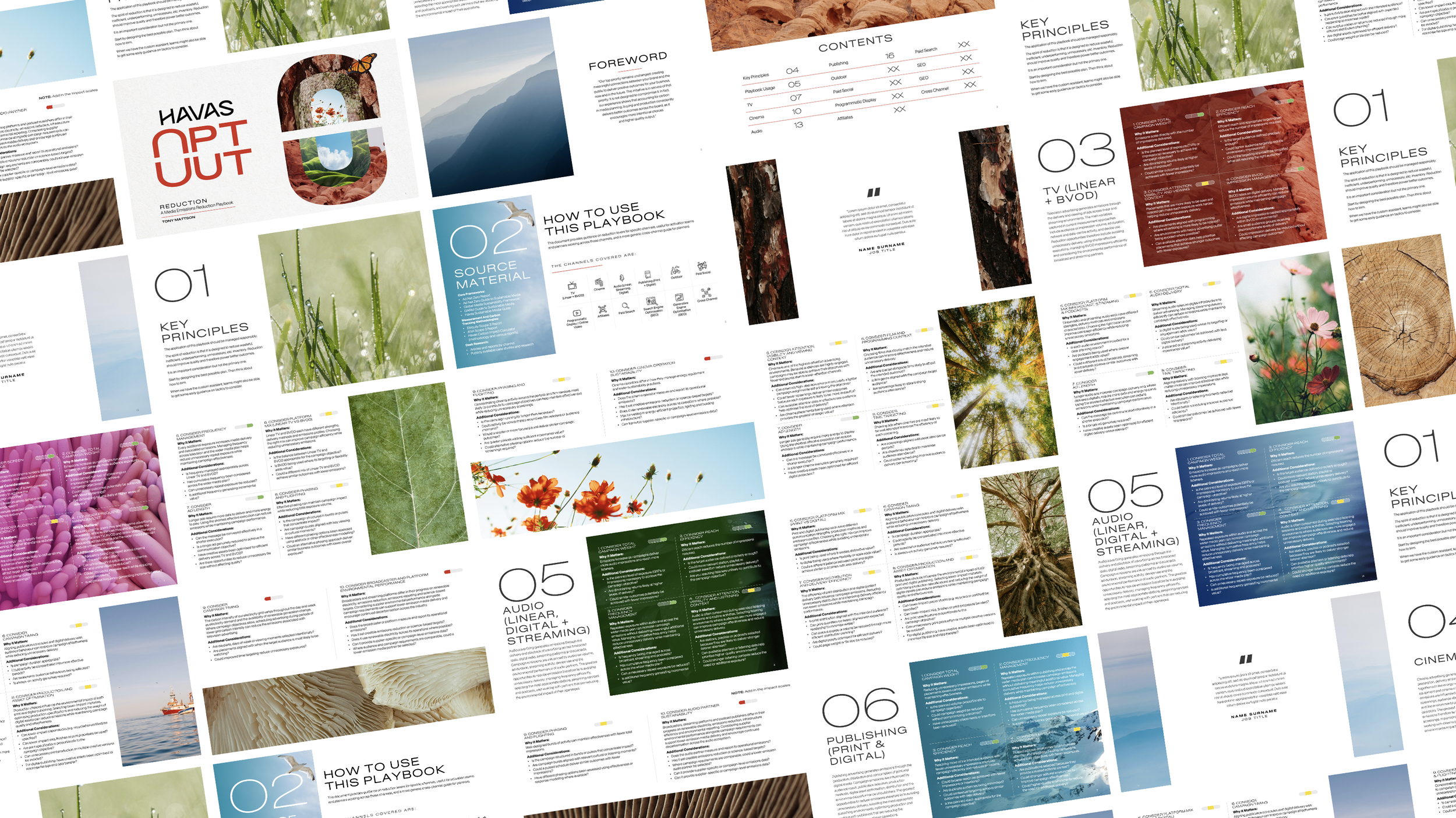
Opt Out Playbook
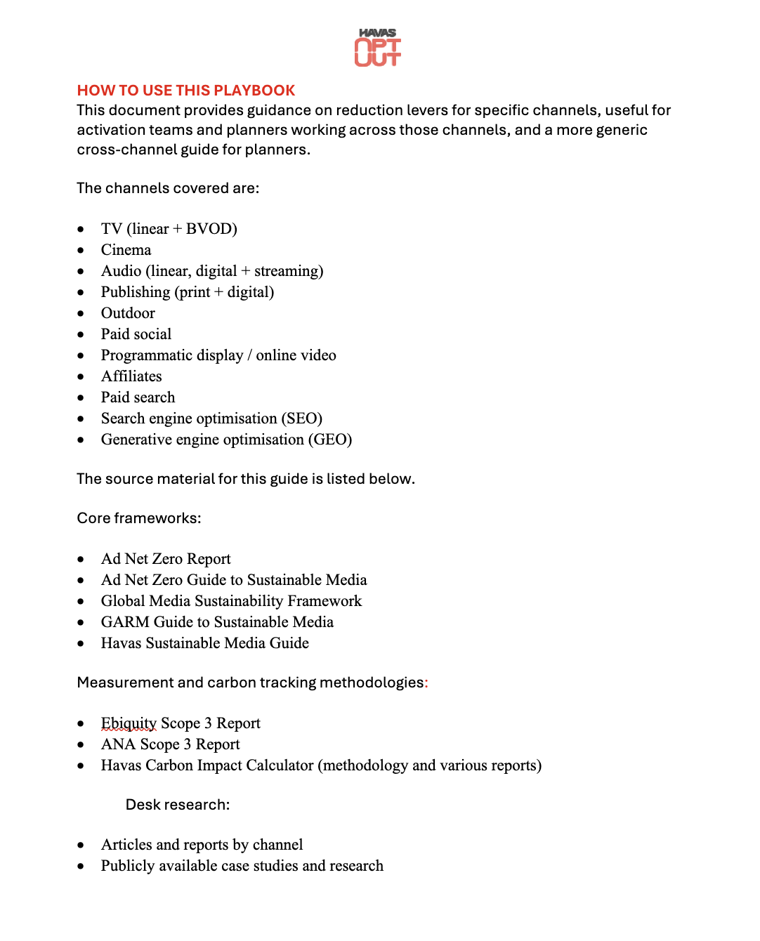
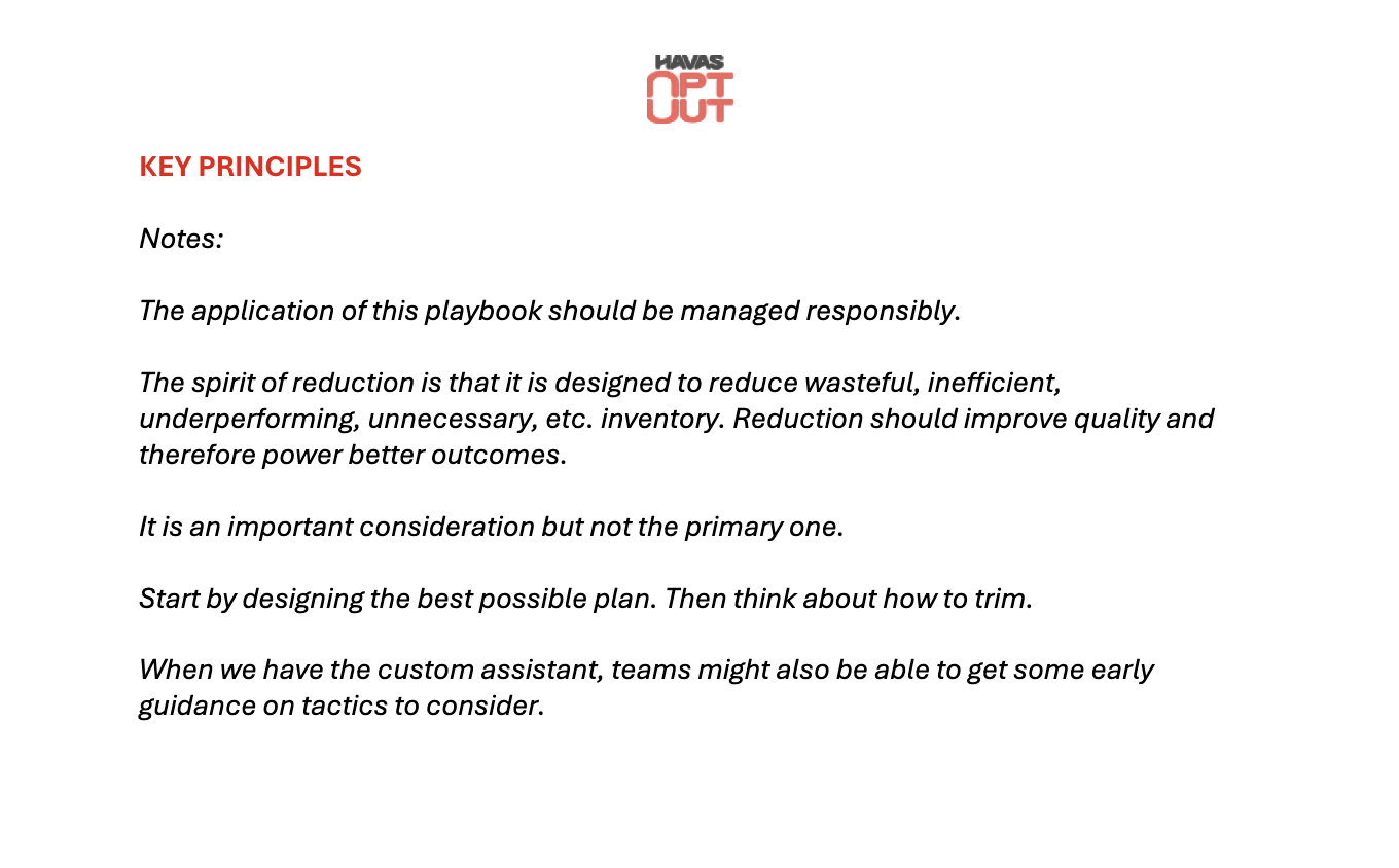
Initial Document Provided
Design (12pt Grid Structure)
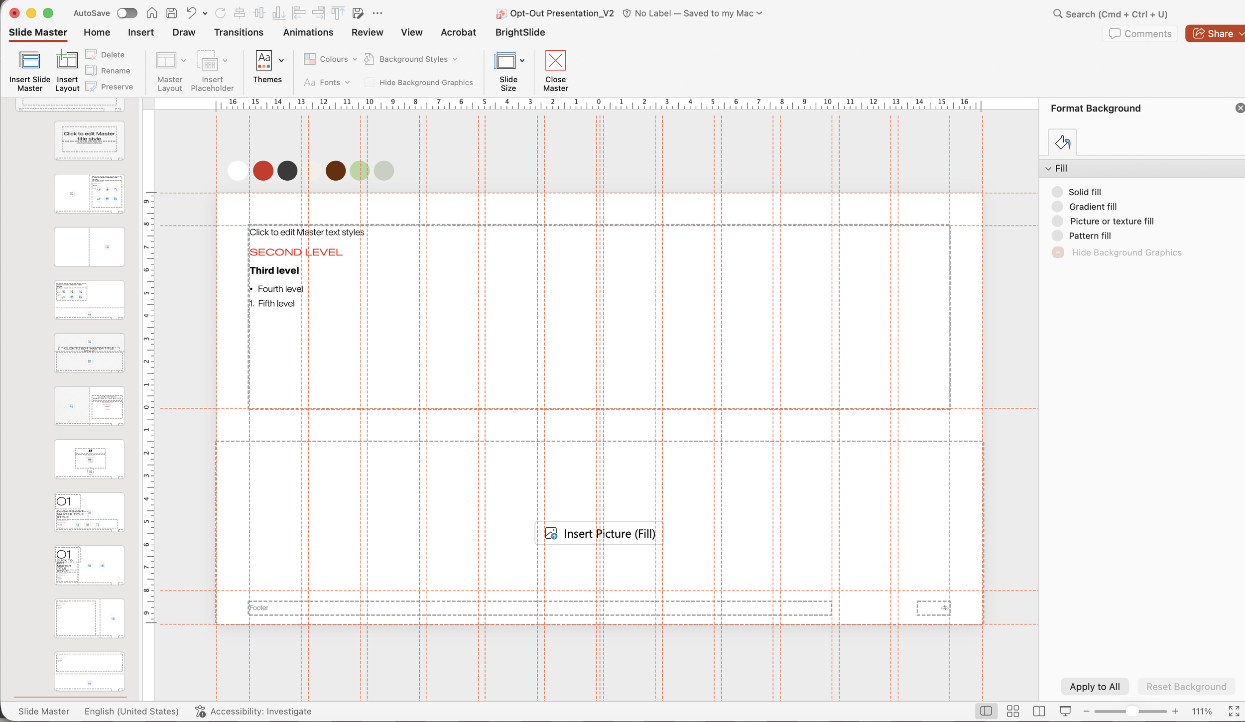
I created the template from scratch, first starting with setting up the Parent Master slide, the grid lines, font pairings and colours. As the information was structured and similar in nature (10 points per channel), only a few different slide variations were needed (quote, introduction etc.) - the rest would be purely repetition.
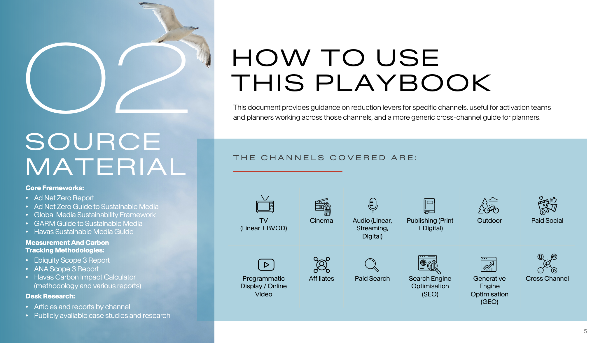
Design (12pt Grid Structure)
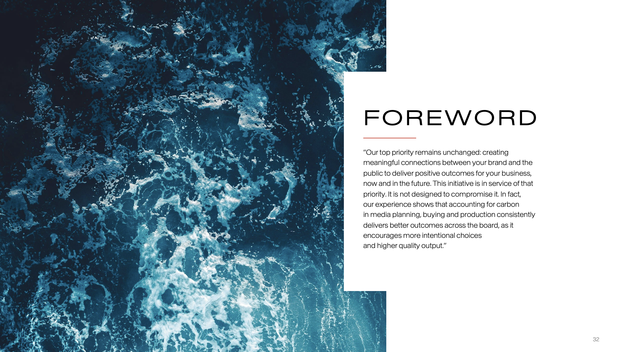
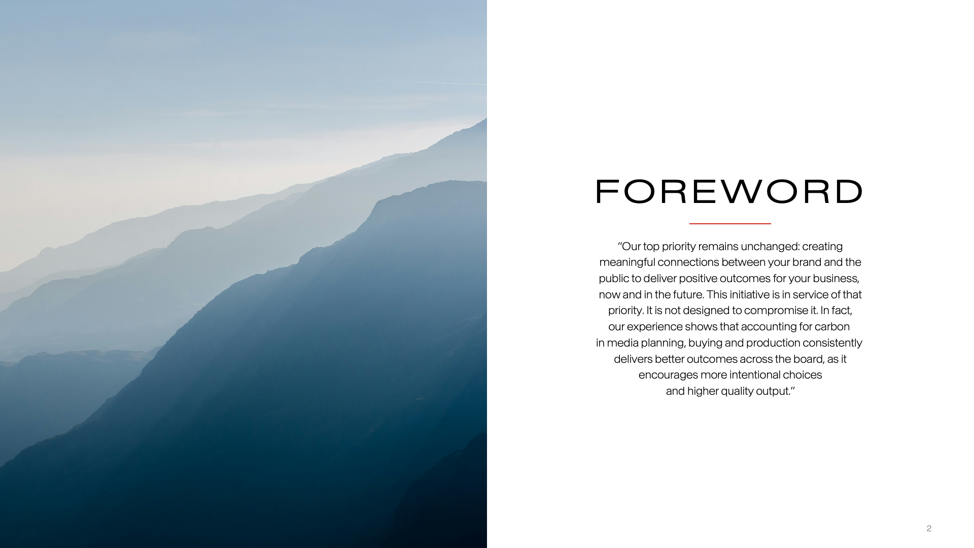
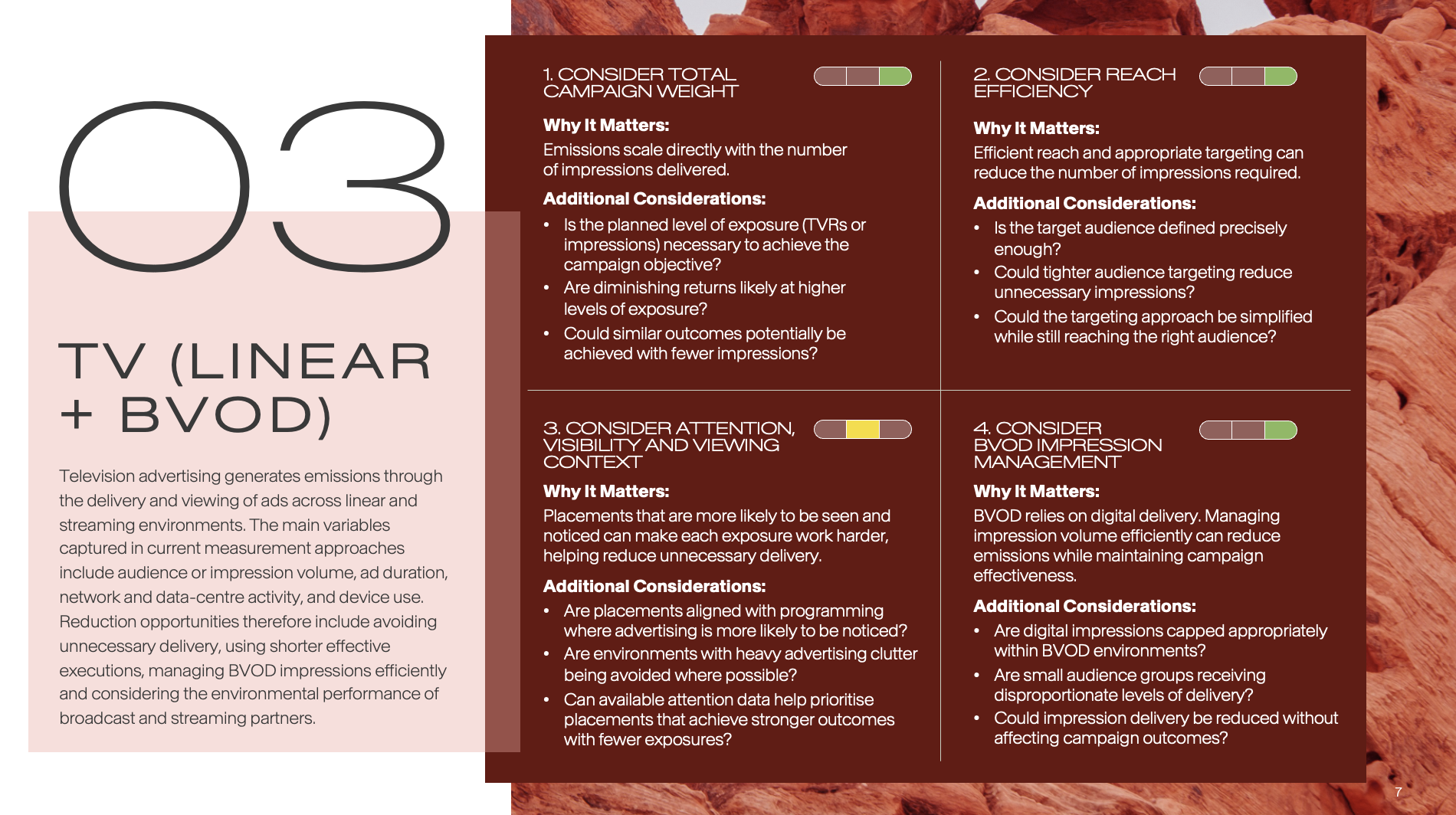
This route however, felt too complex and detracted from the imagery and dense content, so I opted for a more minimalist design with plenty of white space, where the images could be displayed in all their glory.
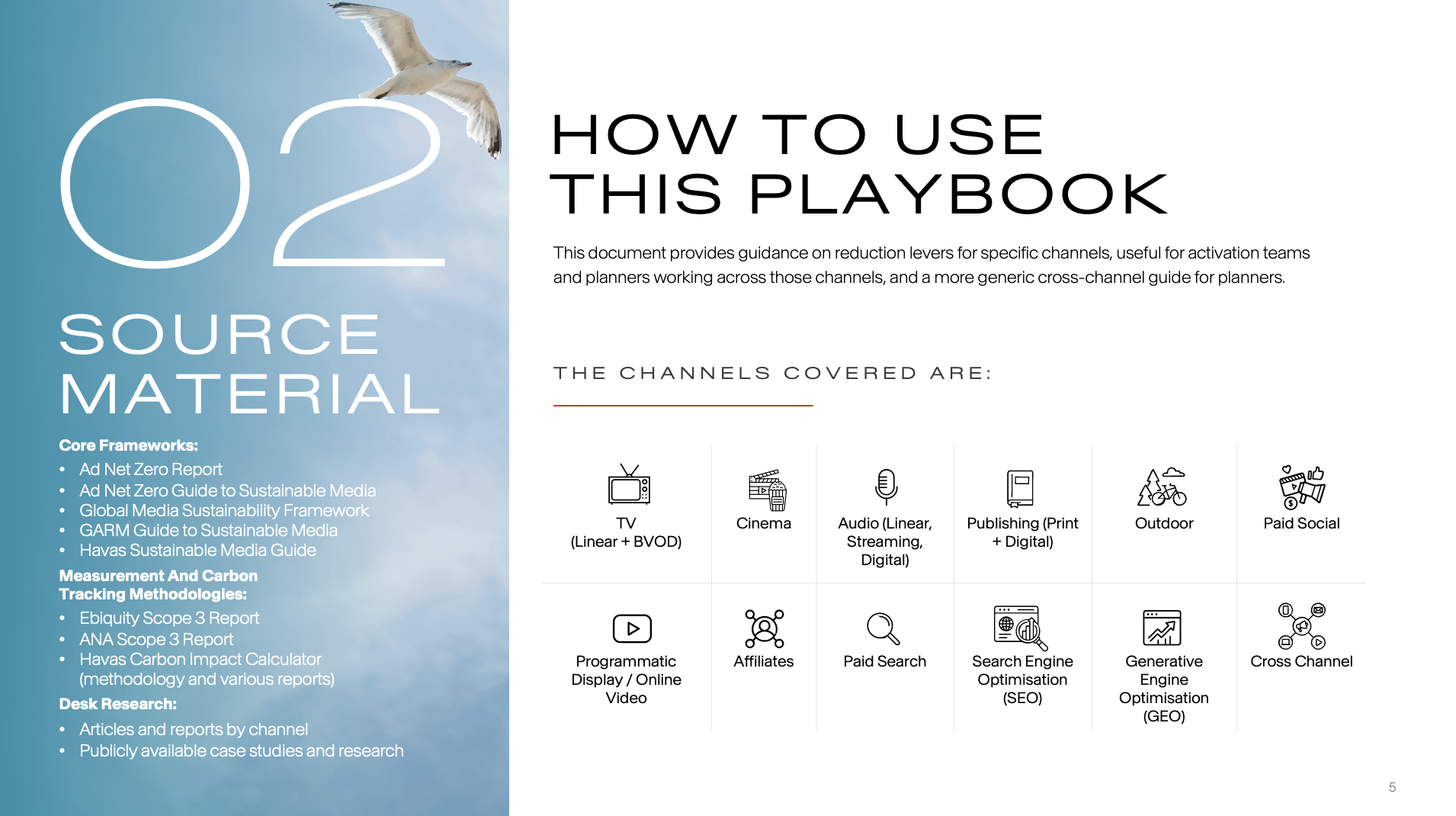
”A reminder never hurt”
Brief:
Create a Playbook for the people of Havas to act as a guide and a reminder of Opt-Out’s best practices. Our goal is to ensure that they refer back to this throughout their careers, so that the carbon reduction levers and guidance that the Playbook offers, becomes second nature to them.
How can we design this so that people will want to read it?
The playbook should be engaging, clear and easy-to-read and refer back to. The look and feel should suit the gravity of the content, whilst remaining true to the original Opt-Out image created.
Solution:
Landscape or Portrait? Initially the thought was that the playbook should be portrait, following the precedent set by previous playbooks. But the question of how people would really be interacting with this, e.g. physical or online, influenced the decision. As this would be likely read on a laptop, with a physical checklist to accompany it, I decided to create the Playbook as a landscape document.
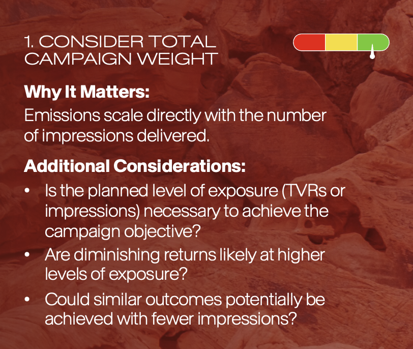
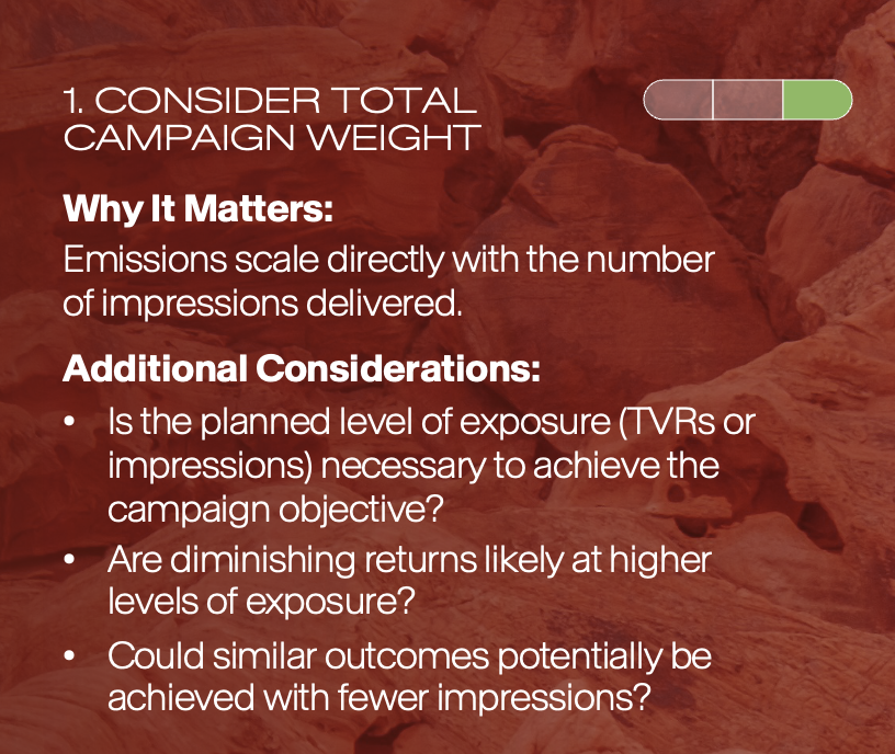
Each reduction lever for each channel had an “Impact Score” - High, Medium or Low. To make the document more visual, I decided to create a scale to indicate the impact. I thought about colour-coding the sections, but I felt this would detract from the minimalist design of the book.
Lastly, I wanted to create a beautiful, refined piece of work with real-life images of nature, e.g. wood rings, leaf veins and water/sea. This not only matched the Opt-Out Press Release image ensuring continuity between the two, but also honed in on the beauty of this World, acting as a reminder of what these practices were for.
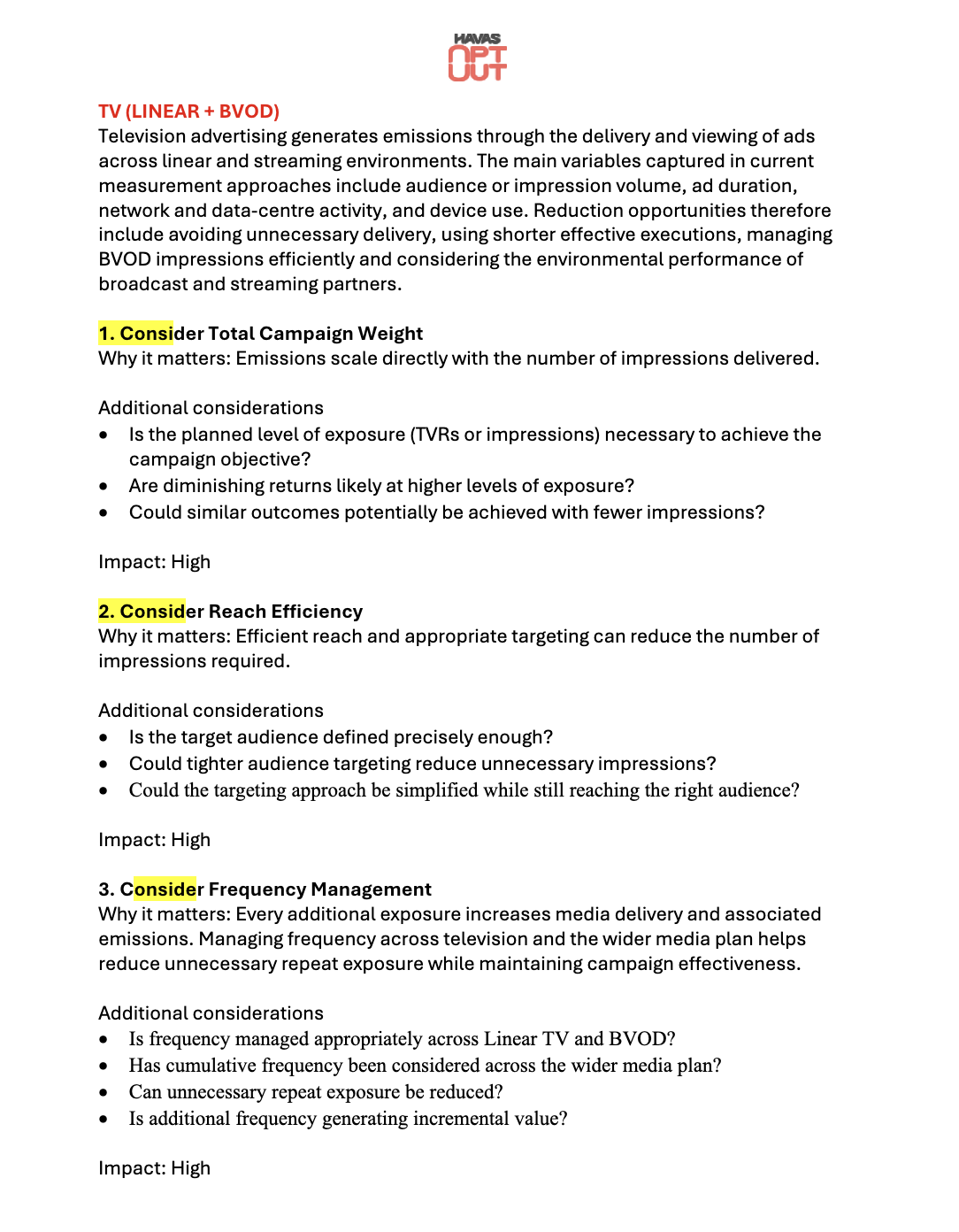
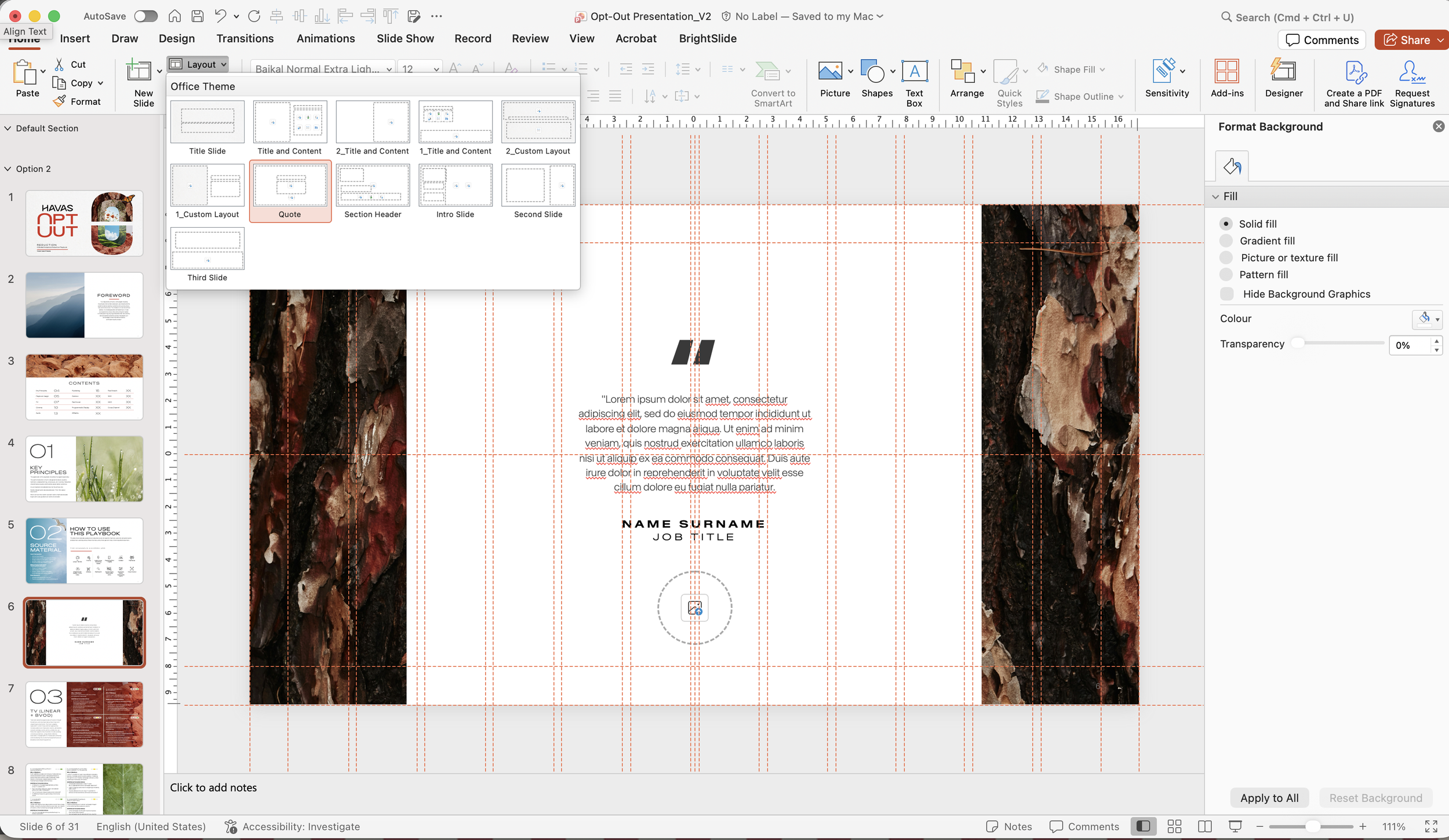
I played around with the structure of the slides and the information given and was tempted to try a layered approach to the information and images, given the initial Opt-Out design I had done the year before. In this case, it signified the layers of questions and additional considerations within the reduction channels - we were trying to encourage the reader to consider multiple routes and ideas, not just one.
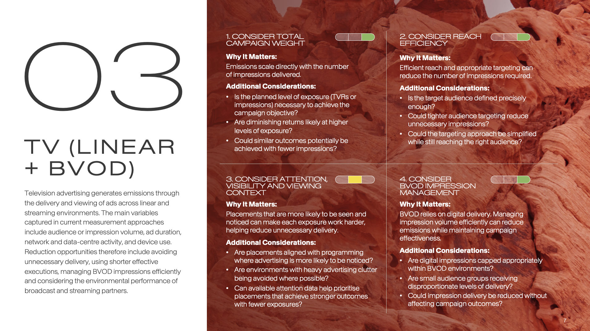
Lastly, I created a scale of impact to visually show the level provided (high/medium/low) - initially I created a png version and uploaded it in, but feedback suggested creating an editable version within PowerPoint itself. Certain decisions, e.g. keeping only the impact colour and greying out the rest instead of using a slider on the scale, improved the readability and made it clearer.
After
Opt-Out Playbook (Pt 2)
PowerPoint Design, Organisation of Information